
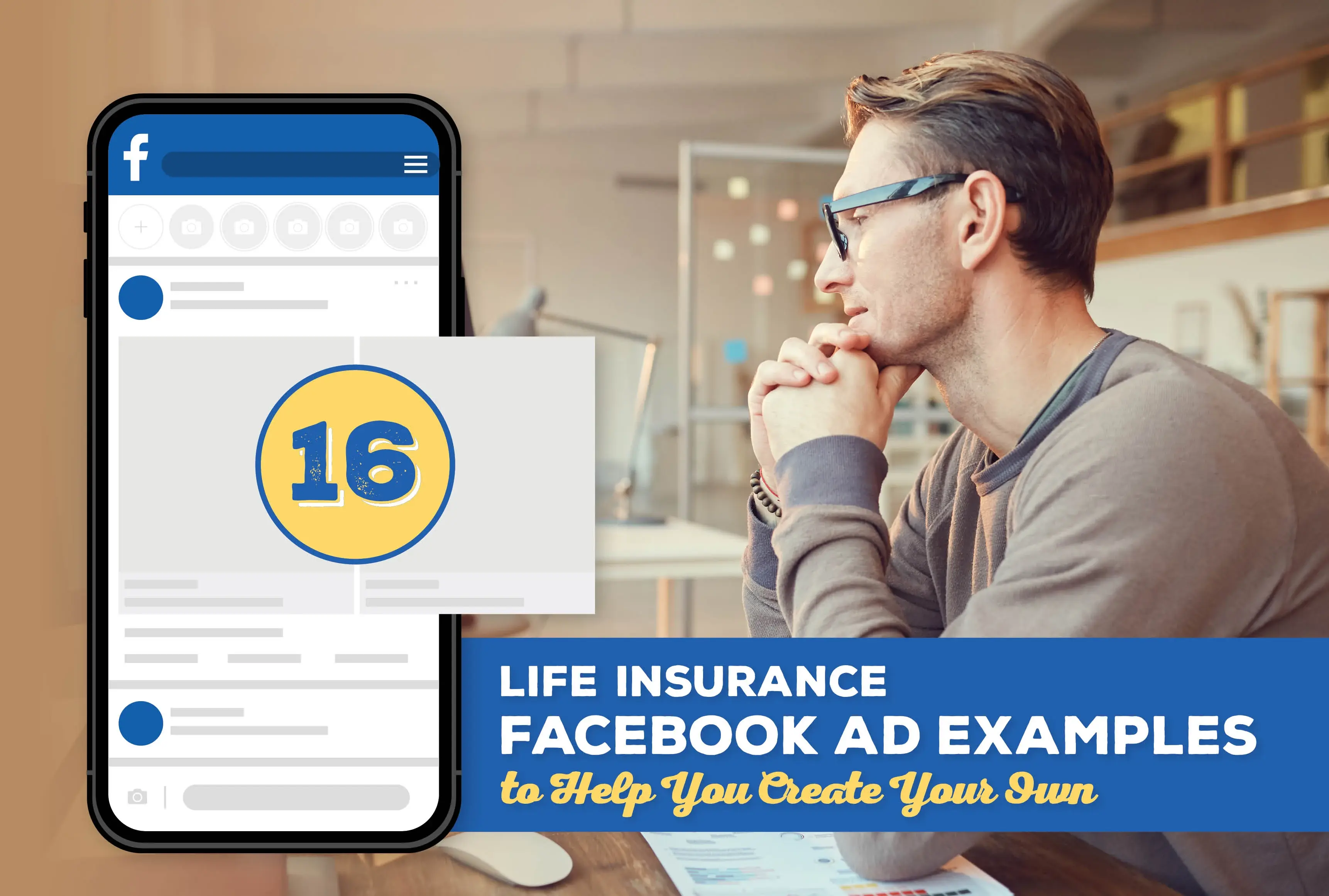
If you’re warming up to the idea of Facebook advertising but have absolutely no clue where to begin, a good practice is quite honestly to look at what everyone else is doing.
In this article, we’re taking a look at life insurance Facebook ad examples to spark some ideas and inspiration.

Facebook Ad Basics
Coming up with a compelling Facebook ad is hard work, and it often takes some trial and error.
That said, using emotional words are a trick of the trade. In marketing speak, we call this emotional marketing value.
Reading an ad that makes you feel scared or like you're missing out is pretty powerful. Using words like "avoid," "before it's too late," or "mistake" are so effective for that reason.
Why do you think so many Medicare ads talk about avoiding penalties? It's the fear!
I won't get too deep into this, but this blog post has over 250 words that spark different emotions.
So keep that in mind when looking through these Facebook ads. I think this frame of mind will help you strengthen your own writing, whether that's Facebook ads, an introduction to your email newsletter, or a simple letter to your clients.
1. Don't Leave Funeral Costs Behind
This Facebook ad definitely plays on fear with it's line, "Don't leave funeral costs behind for your loved ones."
We get the anecdote of a mom's funeral bills behind left behind to her kids, which is something no parent wants to do. Some of the ad is a little cringy, but the message is a solid one.

2. $50,000 Life Insurance for $13/month
The premium claim here is super bold, but letting people know how much life insurance could cost them could break any misconceptions they have.
This ad also plays into emotions with the line "still haven't realized," which hits pretty hard on that fear of missing out.
 3. Life Insurance You Can Rely On
In this ad, we have several quote examples and the call-to-action to get a quote in less than two minutes.
But the main message of this ad is this is life insurance you can count on and rely on. The ad appears to be playing into a sense of comfort and loyalty.

4. Peace of Mind Doesn't Have to Break the Bank
Price is definitely a big hurdle for people looking to buy life insurance. Again, we have an ad showing some premium examples to help dispel any objections about cost.

5. County-Specific Ads
These ads are a little hard to read in the screenshot, but what stood out to me about them is the same business creates dozens of ads, all targeted to a specific city or county.
We have "Attention St. Louis County Seniors," "Attention Hamilton County Residents, " and "Attention San Francisco County Residents," among many others.
The ads are all essentially saying the same thing, but creating different ads and being more specific in them can really grab someone's attention.

6. Looking For Seniors Ages 50+ In Need of a Burial Policy
This ad calls out its target audience plainly in the first line. I'm actually surprised Facebook allowed this ad as they typically frown upon ads that single a person out. But alas, it's running!
 7. Are you a '90s baby?
Ethos Life's ad has a similar tactic of calling out its target audience. The idea is you read this and think "Hey, that's me!"
You tend to pay more attention when you feel an ad is talking specifically to you.

8. In your 40s?
I wanted to share one more example from Ethos Life – it's a similar tactic in a different layout.
This shows you how ads don't have to be complicated at all. Someone typed this out in the Notes app of their iPhone and screenshotted it. That screenshot is the ad.
 9. All these gofundme's make me sad
This ad is right on the nose when it comes to life insurance or final expense insurance.
So many families end up asking others for money to help pay for funeral expenses, which is not the legacy any of us want to have.

10. Seniors Age 45+
This ad is pretty chaotic, but a few things in it are worth paying attention to. First, the initial line calls out the target, invokes fear, and lays out the problem.
Then, we get the solution: "I've got good news for you though.."
The rest of the ad is a bit odd, especially the image that says to tap your age (that wouldn't work on a Facebook ad). But this is a real, live ad!
 11. Attention Seniors
Although this ad is running on a different page, it's pretty clear the same person wrote this ad copy as the last example. We get the call out: "Attention Seniors" (and the very vague "If you are over 47 comment, which is quite bizarre).
And then we get the solution presented to us. Again, the image is pretty spammy and I would not suggest doing something like that.

12. Video that seems to tell a "secret"
I wanted to share the video script on this ad so you have an idea of what others are doing. I personally think this approach is very spammy and borderline misleading, but to each their own.
Video script:
2024 has just started and the secrets have already started coming out. They do not want you to know this but I am still going to go ahead and tell you this. If you are between the ages of 40 to 80 this month, you could protect yourself with a valuable amount of $250,000. At first, I didn’t believe this either, but I thought of giving it a try. All I did was go to this website, answer four simple questions, and that’s it. It is life changing. I left the link below so you can get yours, too. So, don’t wait and click the link below.

13. Unlock peace of mind for pennies a day
This ad is a bit more honorable than the last one, focusing on the love we have for our families.
There's a definite focus on peace of mind, and we also get the commentary on how affordable life insurance can be (as little as $1 a day).

14. Most older Americans without life insurance had no idea they could do this
We have another ad preying on the fear of missing out – the main description reads "Most older Americans without life insurance had no idea they could do this."
When you read that, your initial reaction is, "do what?"

15. Life insurance the easy way
Ethos Life is definitely working to address some common objections when it comes to life insurance. The decision can feel like a whole ordeal, which may involve a lot of time and a medical exam.
This ad knocks those barriers down.

16. Been turned down? Get life insurance
This ad from Family Asset Protection is targeted to people who may have been declined in the past or who have health conditions. It even goes so far as to list out health conditions that are common declines.

A Note on Social Media and Life Insurance Carriers
Steer clear of using brand-specific information.
If you want to talk about a specific carrier or their products on social media, you'll probably need to fill out a usage form or some kind of marketing agreement with that carrier. Legal and Compliance Departments also likely need to review and approve your posts prior to you being able to post them.
It's likely best to focus on the benefits and the need for life insurance and save the specifics for an appointment.
Related: 10 Can’t-Miss Advertising Compliance Rules for Life Insurance and Annuity Producers
We have some pre-made social media assets you are welcome to use any time!

Conclusion
Ready to come up with your own life insurance ads or social media posts? I hope these examples sparked some ideas, or at least gave you an idea of what everyone else is doing.
If you need life insurance training, check out our life insurance training hub for more resources!
Comments