It's no secret that digital marketing is picking up steam these days, but tried-and-true methods of marketing still work, including brochures!
There's something about holding a physical item – leafing through it, keeping it on your side table, passing it on to a friend... a brochure is memorable.
You can use brochures in a number of ways, such as:
- Displaying them in your office for existing clients to pick up
- Delivering them to clients as you deliver their policies
- Having them with you at events, seminars, or presentations
- Mailing them to prospecting lists
You can also tailor the messaging on the brochure depending on what action you want the person to take.
For example, maybe the brochures in your office explain some of the cross-selling products you offer. Maybe the brochures you display at events are a quick sales pitch for your business. Maybe the brochures you mail to cold leads are focused on AEP or annual reviews.
No matter what messaging or use case you have in mind, brochures are:
- Cost-efficient
- Branding tools
- Versatile
- Tangible
If you want a brochure for your insurance agency, there is a DIY option that can save you some money.
Why Make a DIY Brochure?
If you're looking to make your own brochure, we're going to assume you have more time than money.
Going the DIY (do-it-yourself) route will take a little time on your part, but it'll save you the fees you'd otherwise pay to a designer and project manager.
So, if you have more money than time, stop here and just hire a designer or consultant to do this for you!
What You Need to Make Your Insurance Agency Brochure
Here's a checklist of elements that are great to have before starting:
- Logo
- Photos of you, your building, your staff, etc.
- Color scheme
- A goal for the brochure
- Copy that fits your goal
If you don't have any nice photos, you can opt for stock photography, but it's nowhere near as nice and personalized. Here are some stock photography sites: Burst by Shopify and Pexels.
In addition, if you don't have a logo, you can just type your insurance business name in whatever font you choose. If you want a logo, you can hire a logo designer to create one for you!
Finally, if you don't have a color scheme, you can start from a pre-made template (which we'll show you soon), but just keep in mind that if you do other marketing pieces, you'll want things to look cohesive. If you're constantly using different fonts and color schemes, people will start to get confused, and they won't recognize your brand.
Finally, a goal – and copy that fits the goal – are mandatory. If you're not good with words, it may be worth hiring a copywriter, but we'll give some pointers to help you get started.
Your Insurance Agency Brand
 Mistie Carter, Analytics & Traffic Acquisition Manager here at New Horizons explains that there is sometimes a bit of confusion surrounding a company's "brand."
She explains that people often think a brand is just a logo, but in reality, it's so much more than that: "The brand is how consumers feel when they interact with your business, your advertisement, or with you directly."
In a business based on relationships, Mistie says that having consistent brand elements is essential. These elements include your logo, name, color scheme, voice, and even your messaging.
"This not only helps to build up your brand equity – which is the value that comes from a consumer’s perception of your brand and not directly from the product or services you provide – but also helps to build trust in you in the marketplace," she says.
How to Make a Brochure in Canva
Canva is a design platform where you can easily put together brochures, Facebook ads, posters, flyers, email headers – you name it, you can make it in Canva.
It's completely free to use, and there are even templates available that you can edit, making the entire "DIY" thing that much easier.
We especially like it for beginners who aren't comfortable with Adobe design software. You don't need experience with fancy softwares to be able to design a good-lookin' brochure.
Perhaps the best part is that Canva is so user-friendly. You could easily go there, create an account, click on "brochure," start clicking around, and we're pretty sure you'd have a nice brochure in an hour flat. But, we'll go ahead and give you some pointers just in case.
November 2020 Update! Canva recently launched a new, all-in-one page for Canva Brochures. It's much easier to find a template that works for you, and their ordering process is simplified. There are also tips on how to create your own brochure and get your branding right.
Step 1: Go to Canva Brochures.
Easy peasy: https://www.canva.com/brochures/
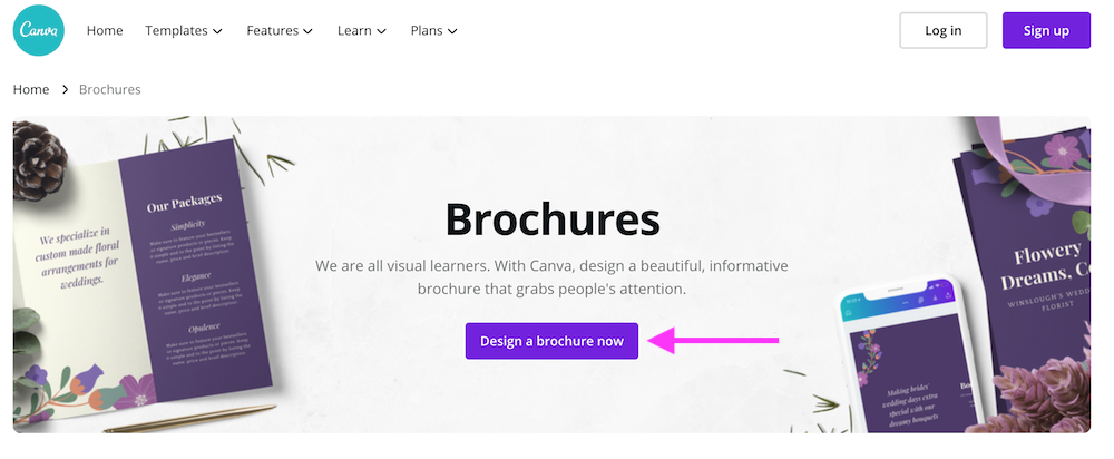
Step 2: Click "Design a Brochure Now."
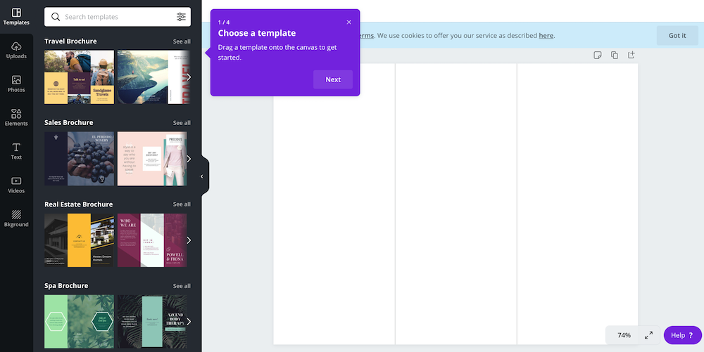
Step 3: Choose a template.
There are dozens of brochure templates to choose from, and they're sorted by industry category to help guide you if you're not sure which one to choose.
Most of the templates are free, so it's fair game on whatever sparks your fancy.
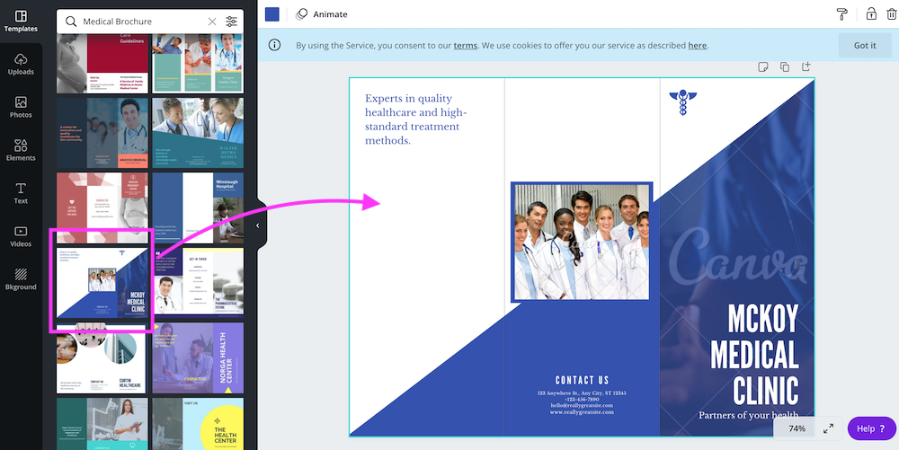
At this point, you have a template to work from that you can edit and fill in with your own information.
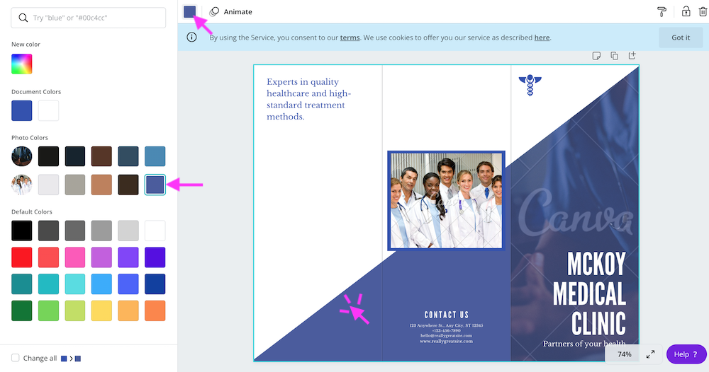
To change the colors, just click on the color you want to change and select a new one color section. If you've uploaded any of your own images, Canva detects those colors and will suggest them.
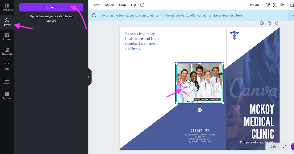
To add your own photos, upload them in the lefthand menu area and drag and drop them onto the existing ones.
To edit text, just click the existing text and start typing. It couldn't be easier!
And that's how you make a brochure in Canva – easy as pie.
We'll show you an example of a dummy brochure we created for our local agency to give you some inspiration.
Example DIY Insurance Agency Brochure
At this point, we've chosen a free template in Canva, but now we need to customize it with:
- Our insurance agency's logo
- Our insurance agency's photos
- Our insurance agency's color scheme
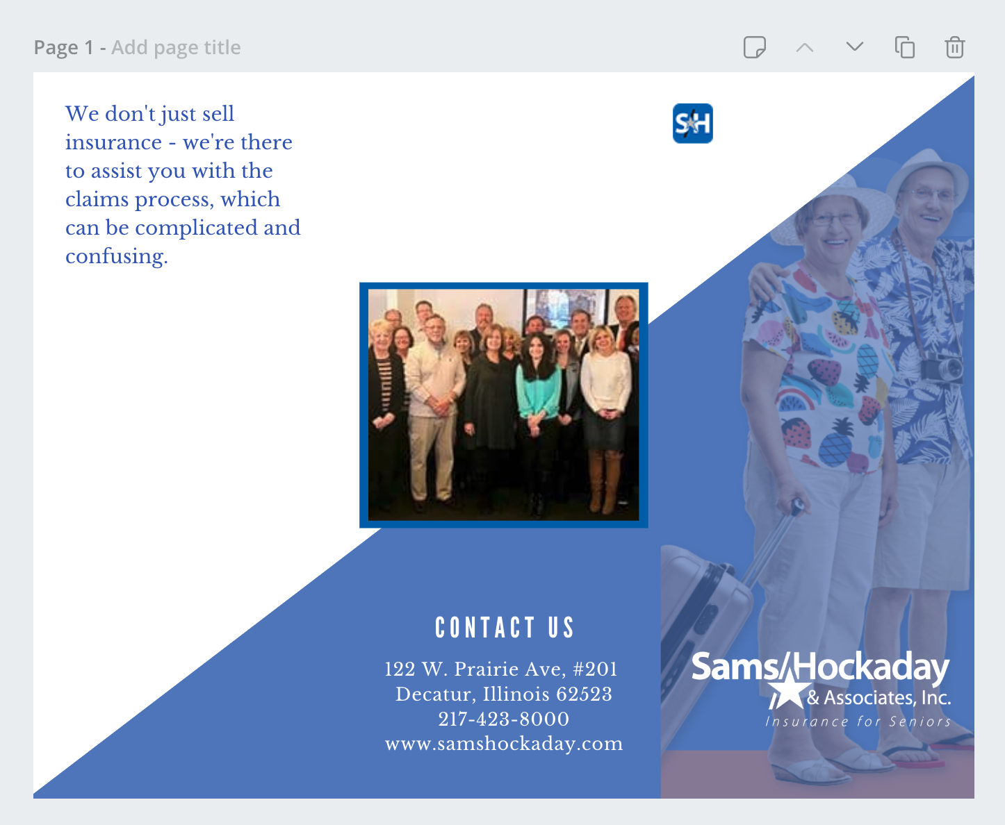
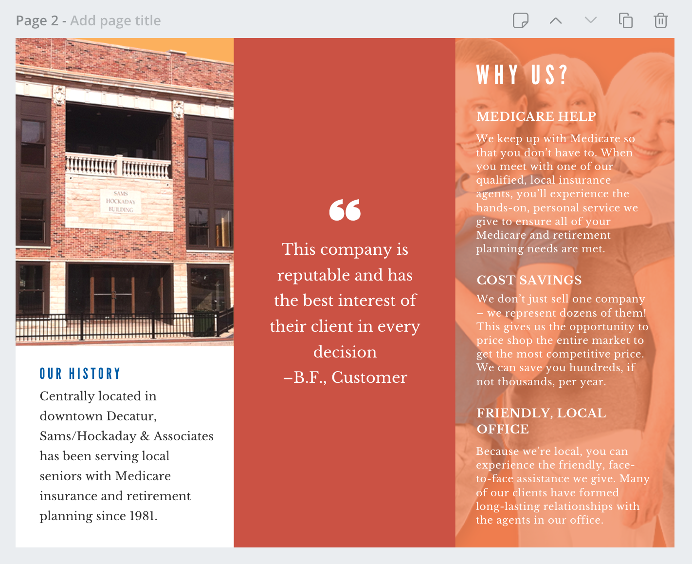
In addition, we've decided that the goal of this brochure is to give a quick understanding of who we are and why someone would want our help.
This is a brochure that can be used in several different ways – it could be presented at a local event, we could display it at the front of our office, and we could also include it when we deliver our policies to clients.
So, after simply adding our stuff in place of the dummy content on the template, here's the front:
And here's the back:
And here's a better idea of how the brochure would be folded, which is important to keep in mind when placing your own content:
You can also view the brochure up-close and personal here.
One thing that's important (that you may not have realized) is that white space – or some breathing room – is important.
You can see several areas on the brochure where there aren't any text or photos. While it may seem like wasted space, it actually makes the brochure a lot easier to consume without feeling overwhelmed.
Exporting and Printing Your DIY Insurance Brochure
Once you're happy with how things look – and make sure the text is large enough for a senior audience to read! – it's time to export your file and order some prints.
Order directly from Canva
The easiest possible route is to actually order your brochure straight from Canva.
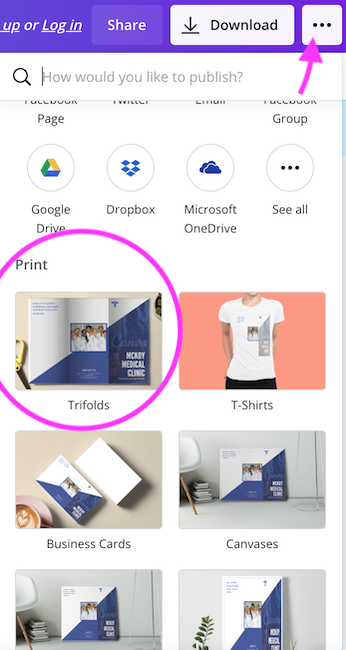
If you're not logged in yet, you can do that by clicking the three dots in the top right, and then click the "Trifolds" image. You'll then be prompted to log in.
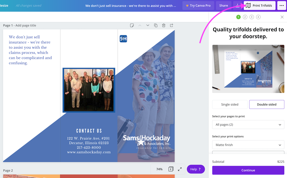
If you are logged in, you'll see a "Print Trifolds" button in the top right.
Save money by ordering from a different printing company
If you're up for it, you can save some money by exporting the PDF file and uploading it to a different printer like Overnight Prints or Vistaprint.
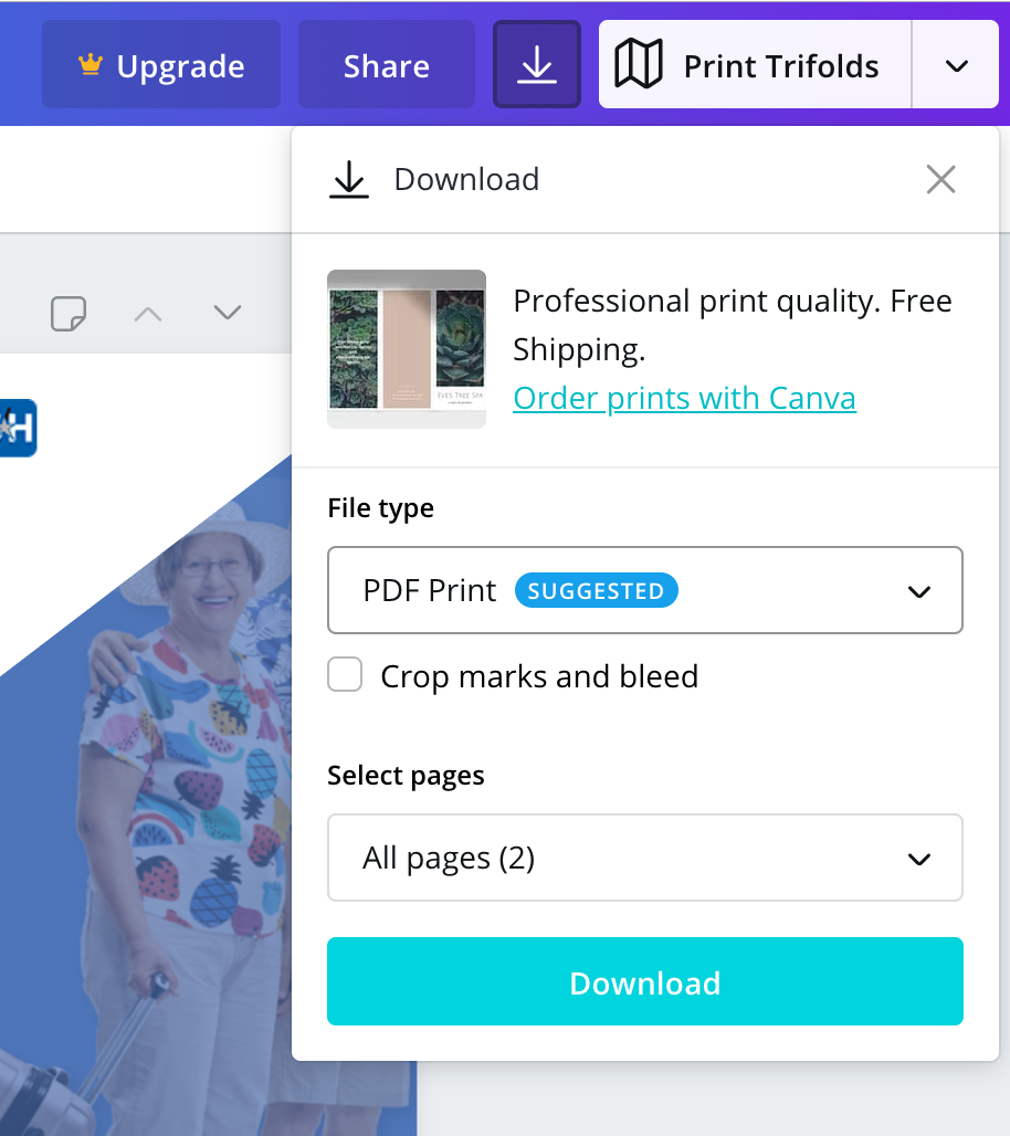
To export your file for printing, click the drop down arrow next to "Print Trifolds" and select "Download."
The file type should be "PDF Print (Suggested)." Do not select Crop marks and bleed.
Then, just click "Download"!
Now that you have your file (it should be located in your "Downloads" folder at this point), you can upload it to the printer of your choice.
Overnight Prints
With a printer like Overnight Prints, you would navigate to their "Brochures" page and select "Upload Info/Start Files."
The specifications you'd want for a brochure like the one we just did in Canva would be the following:
- 8.5" x 11" brochure
- Double-sided
- 100lbs Gloss
- Tri-Fold
For 500 copies at Overnight Prints, you're looking at under $150.
Vistaprint
There are many more printers out there, but another popular option would be Vistaprint. The process is much the same as Overnight Prints, whereby you navigate to the "Brochures" page and enter your specs:
- Tri-fold
- 8.5" x 11"
- Standard glossy (cheaper) or Premium glossy (pricier, but nicer)
With Vistaprint, you can also order a Brochure Holder, which is nice if you plan to display them in your office or at an event. Once you've made your selections, you'll go on to the next page where you will upload your PDF.
The cost for 500 copies (standard glossy) is around $200 with Vistaprint, but keep in mind that Vistaprint often has major discounts going on, saving you upwards of 40-50% depending on the promotion at the time.
If you plan to do several marketing materials, it may be worth subscribing to the Vistaprint email newsletters and checking for discounts periodically.
Conclusion
There you have it! You're now armed with the information you need to create your very own DIY brochure for your insurance agency.
If you're looking for even more marketing ideas, we've put together a massive guide that has 17 different ways to reach your target audience. There are both free and paid ideas in there, so there's truly something for everyone!
Check it out here: Marketing 101 for Independent Insurance Agents: 17 Ways to Successfully Generate More Leads
Thanks for reading, and be sure to let us know in the comments below if you give it a try!
