The world wide web is complicated. I get that.
Sure, a website would be nice, but what the heck do I know about HTML and Javascript and CSS and all those other tech-y things?
A few years ago, you would need to know that stuff, but thanks to a variety of geeks and developers out there, you can actually set up your website without knowing much of anything.
In this article, I’m going to teach you – step-by-step – how to set up your own agent website using some of the major website builders out there. (No coding skills required.)
One thing I want to point out is that using these methods to create a website is excellent to have an online presence. An online presence gives you credibility, and your clients expect it. This also allows you to add the site to your email signature, business cards, mailers, and so on. It’s just a nice touch.
However, having a website that brings in consistent traffic and generates quality leads is a lot more involved than setting up a bare bones website. To really be an online powerhouse, you need to do things like:
- Spend money on ads
- Keep up a consistent, quality blog
- Use SEO tactics to rank higher on search engines
- Keep a social media presence
- Keep an eye on data and analytics
- Etc.
Doing those things isn’t impossible, but we just want to make it clear that bringing in consistent leads requires a lot of time, effort, and money. This article will show you how to get a site going, but this is all entry-level stuff.
If you want to have a website that’s more than just an online presence, we recommend reading “We Studied 50 Websites of Independent Insurance Agents — And Here’s What We Found.” This will give you a better idea of how to make a website that really counts and attracts leads.
And if you’re still not convinced a website is a worthy investment, we recommend reading “Does Having a Website Really Make a Difference?”
This article is going to be a long one, so I would advise you to skip ahead to the website builder you’re most interested in by clicking one of the links below.
If you have no clue what the difference is, here’s a scale of each one ranging from simplest to most complex. Please note that Wix, Strikingly, and Squarespace are incredibly similar. They each have the same set-up. I’ll share my final thoughts on them at the end of this article.

As you can probably guess, the simplest is the quickest to set up, but it doesn’t have as many features available. The most complex takes the longest to set up, but you have a lot more options.
Without further ado, let’s get started with the simplest option of them all: About.me.
About.me
The simplest option we can think of.
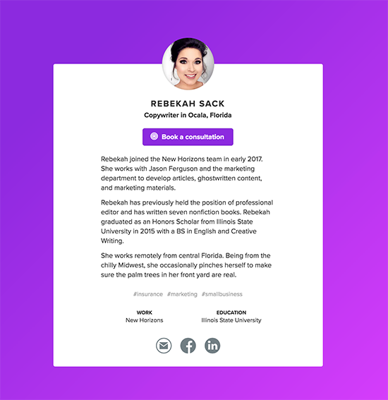
About.me is a simple web page that presents who you are and what you do. That’s about it.
As with all things these days, there’s a free version and a paid version.
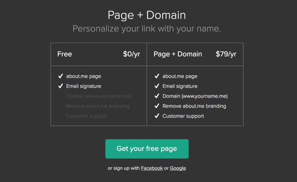
IF you’re thinking about doing the paid version, I would urge you to NOT choose this option. For what you get, it’s not a great deal (in my opinion, of course). Some of the other options in this article would be a better bang for your buck.
However, if you just want a simple-as-can-be web page that doesn’t cost you a dime, this is worth looking into.
To begin, you click that blue-green button (located on the About.me homepage) that says “Get your free page.”
Enter your email address.
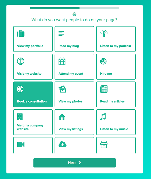
Then, just follow the prompts until you get to the “What do you want people to do on your page?” part.
This is entirely up to you, but I would recommend choosing one of the following:
- Visit my website
- Book a consultation
- Schedule an appointment
- Sign up for my newsletter
- Read my blog
In all honestly, if you’re using a site as simple as About.me, you’re best choosing something simple, like Book a consultation. That’s really what you want people to do anyways, right?
Once you’re done, you can choose your design. As you imagined, the options are fairly limited and simple.
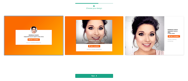
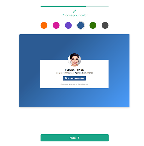
It’s entirely up to you which one you choose. Once you do, you can pick a color – also personal preference here. Again, not many choices, but you will have the option to change it later on.
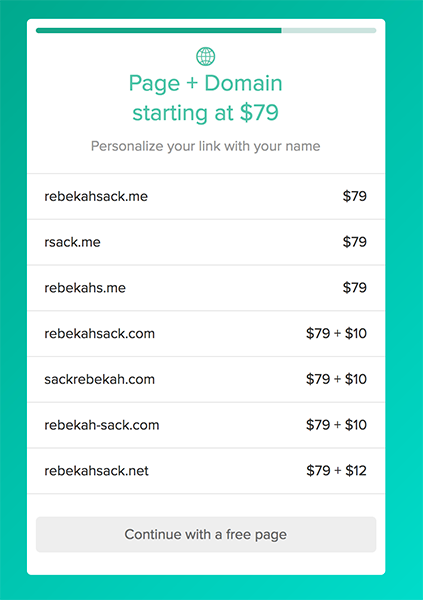
After that, About.me is going to try to upsell you. We strongly advise that you don’t take the bait here, as the price is really steep for what you get.
Click “Continue with a free page.”
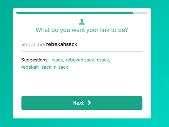
After this, you get to choose your own link. Since the hosting is free, your URL will be About.me/YOURNAME.
If you want your own domain, you’ll want to skip to some of the other options.
OK – your page is created! Simple as that.
Now, you can add a few things, such as a bio. Let’s do that.
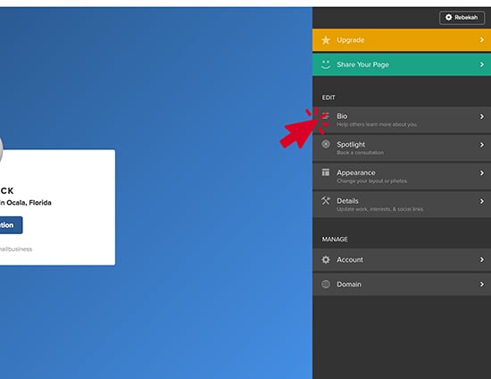
Once that’s done, you have the option to make a few appearance changes, such as the background color and the layout again.
You can also change your occupation, your interests, and your social media links.
That’s it! Done. You now have a simple agent website.
Wix
On up we go to the next website builder – Wix. Wix also has a free version, but you’re also stuck with:
- The Wix advertisement at the top of your website
- No custom domain (your site will always have wix.com in the URL)
- Limited storage space and bandwidth
However, if you don’t care about these things and want a website that’s a little more customized than About.me, Wix could be the perfect choice.
To get started, go to the Wix.com homepage and click “Start Now.”
From here, you can create an account or sign in through your Facebook or Google accounts.
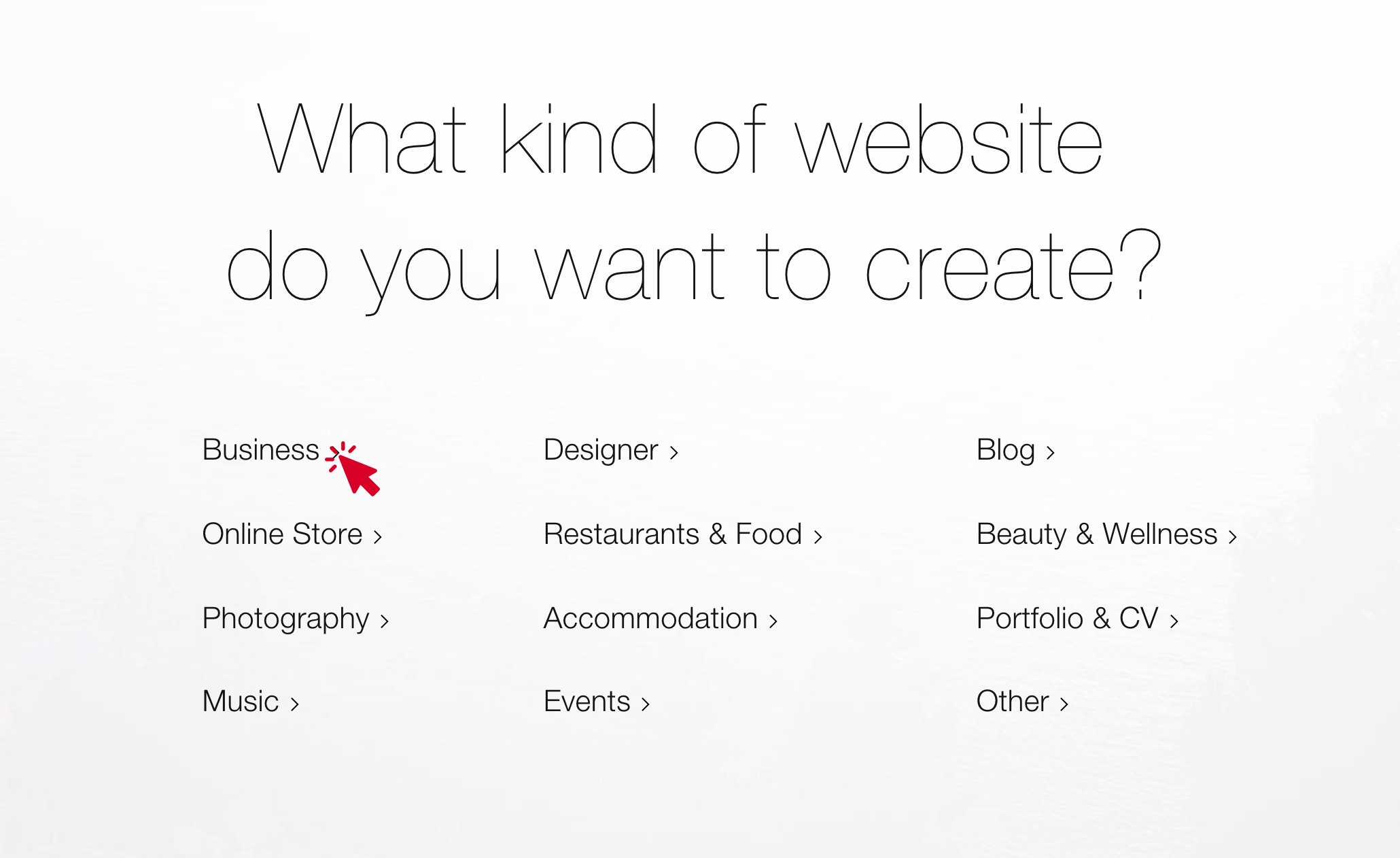
Now, you need to choose what type of website you want to create. Click “Business.”
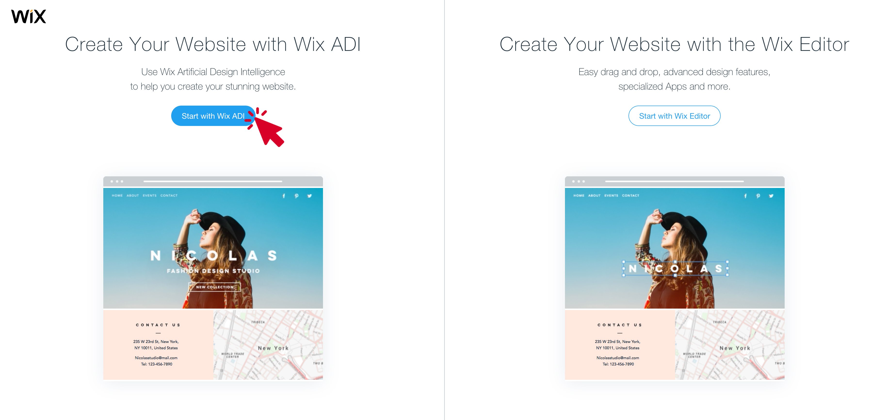
From here, you can choose to create your website with Wix ADI or the traditional Wix Editor. The difference between the two is that the ADI option asks you some questions and then spits out a website for you. With the Editor, you’re in charge of dragging, dropping, and customizing a template on your own.
The ADI is easier to set up, but the Editor has more customization options.
For this tutorial, I’ll choose Wix ADI.
From here, fill in the kind of business — Insurance Agency — and click next.
Now, you can choose which features your website should have. It’s up to you, but I recommend you at least choose “Take booking & appointments.” You can also create a blog, which I highly recommend, but if it’s too much for now, don’t worry about it.
From there, write down your business name. Include your address if you have an office, add your social media, and put in some contact information.
As for the logo, don’t get hung up on it. You can easily hire someone on Upwork to create one for you, you can use the Squarespace logo tool, or you can just use the name of your business in a nice font.
Once you’re done with that, you’ll see this screen:
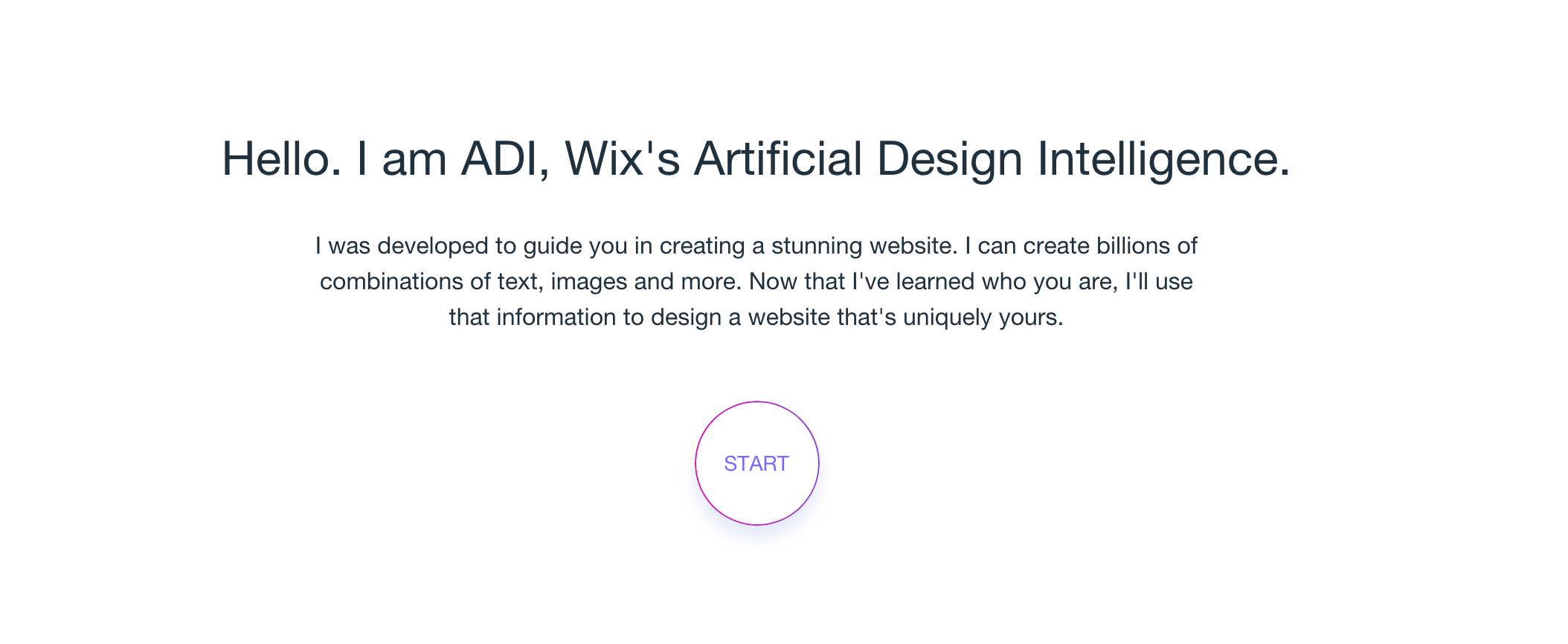
Click START.
Go through the prompts, but make sure to keep your business and your audience in mind. Finally, click “Create My Homepage.”
Here’s what I have now:
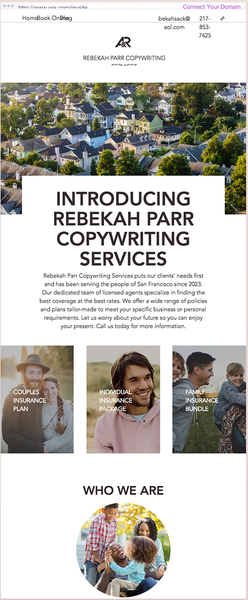
Not bad! Now, just follow the prompts on the right side of the screen.
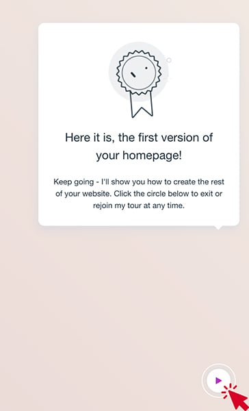
When you click that button, you can move on to customize and finish up your site.
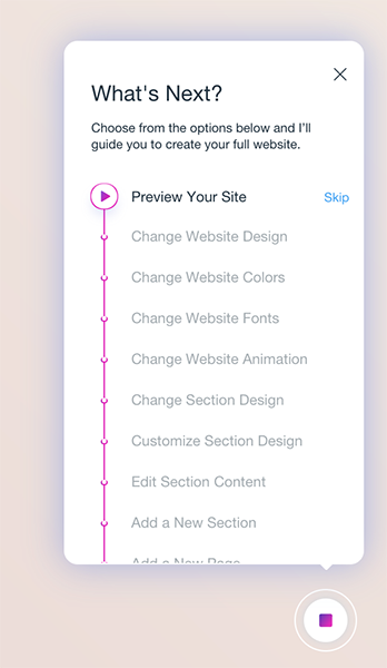
You can change the design if you don’t like what the ADI spit out, you can change the colors, fonts, animation, content, and so on.
I will say that Wix was extremely slow in loading and froze up more than a few times. I often got stuck on the following screen for extended periods of time. I let it run and did other things just to see how long it took to come back to life, and after an hour, it was still stuck:
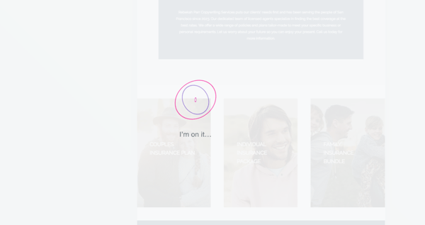
It might just be an issue with the ADI system, but still something to note.
Once you’re done tweaking everything, go to the Site Manager and adjust the information in the Overview tab.
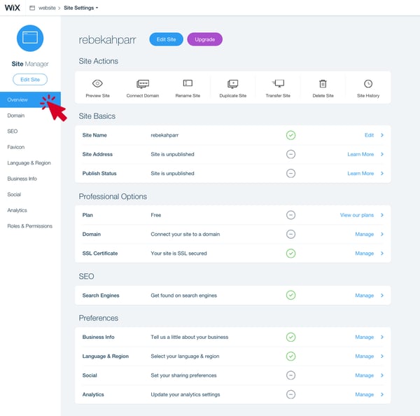
Once you’re done making changes and your site is exactly how you want it, you can publish it.
If you want to stick with the free version, click the “Edit Site” button. From here, you can click “Publish” in the top right corner.

That’s it! You’re done.
But, if you want to upgrade to a paid version, you can go back to your Site Editor and click the purple “Upgrade” button.
From here, you have options.

The benefit of upgrading to a paid version is that you can ditch the Wix ads that will show up on your site. You can also have your own URL instead of the “wix.com” URL you’re stuck with in the free version.
You can see some of the other benefits listed under each plan level.
And there you have it! A professional agent website.
Strikingly
Strikingly is another website builder that’s more of a drag and drop situation. It’s incredibly user-friendly – actually the most user friendly of these 3 middle options – but as always, there’s a free and paid version. I’ll explain that later in this section.
To get started, go to the Strikingly homepage and fill out the “Get Started” form.
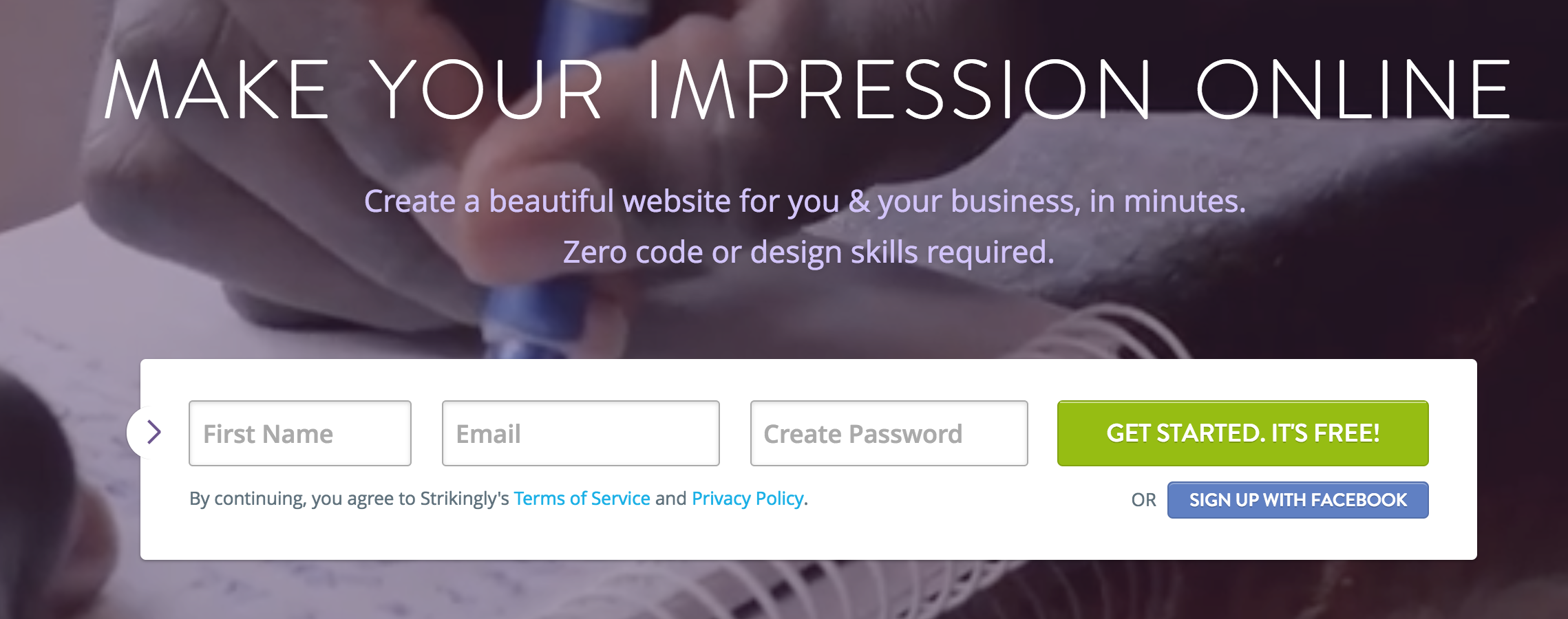
From here, choose a template. Try narrowing your options by clicking “Business.”

Now, it’s up to you to choose a template that you think matches your business. Remember that anything can be customized, so as long as the template is functional, don’t worry too much about the photos or the text that’s there already.
For this demo, we’re going to choose Zine.
Once you choose your template, you’ll be prompted to take a tour. We recommend this!
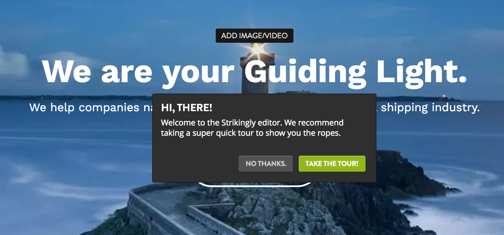
This will familiarize with you with the Editor pane on the left side of the page.
When you’re done, it’s time to get started!
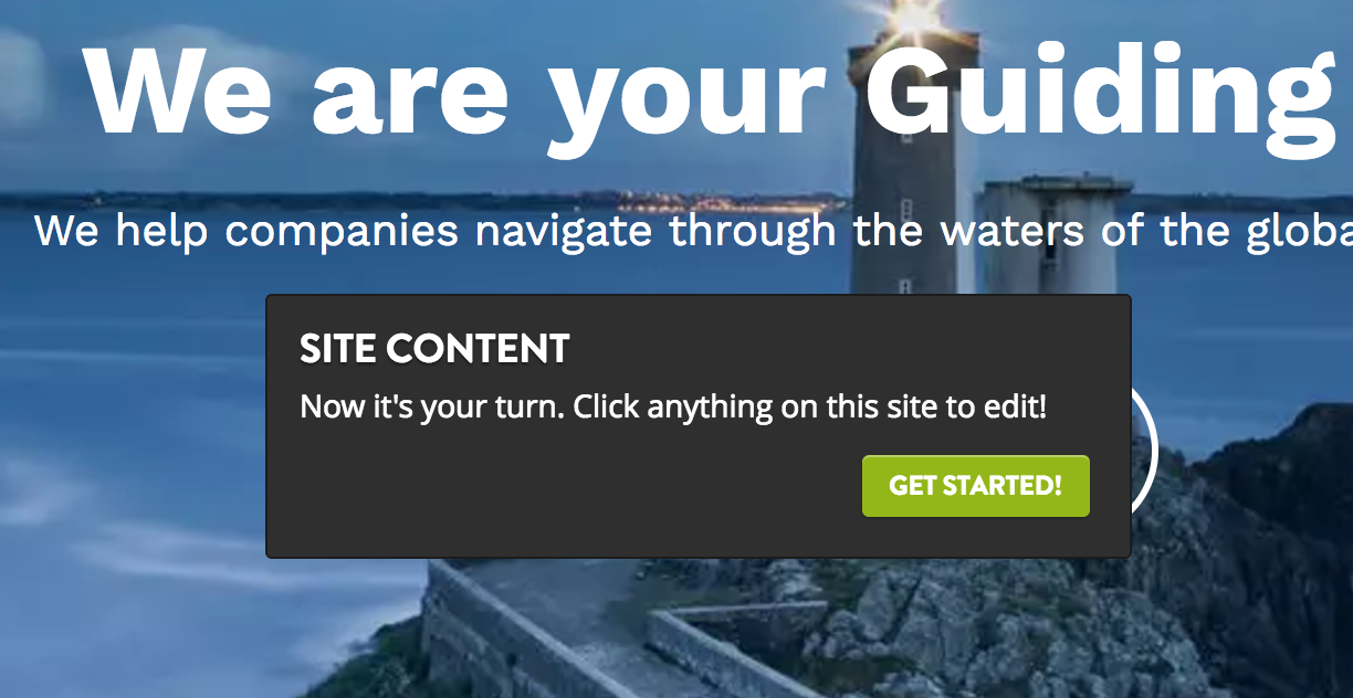
I’m going to make some tweaks, and I’ll be right back.
I’ve now made some changes.
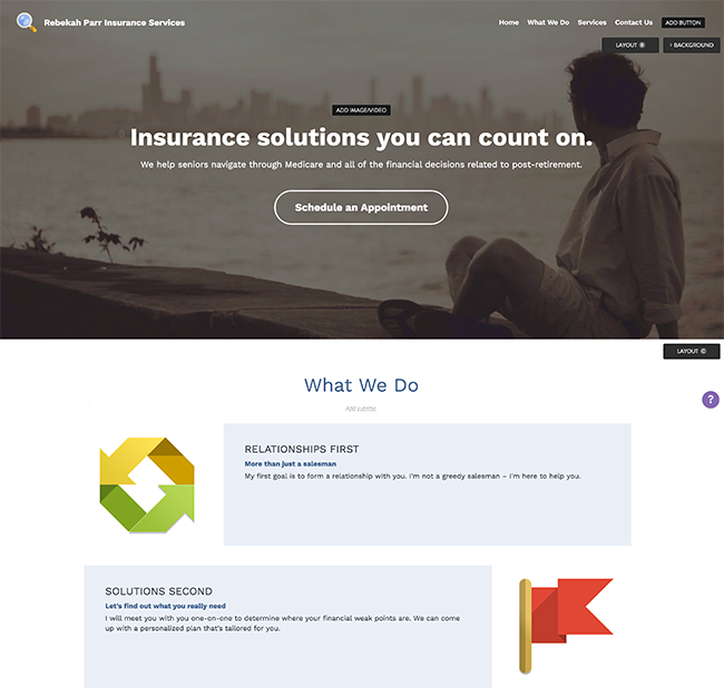
Not bad, right?
This editor has actually been the most user-friendly to use compared to the rest (in my opinion, of course).
Once you’re happy with the images, sections, and words on your pages, you’ll want to go to the Settings button in the left panel.
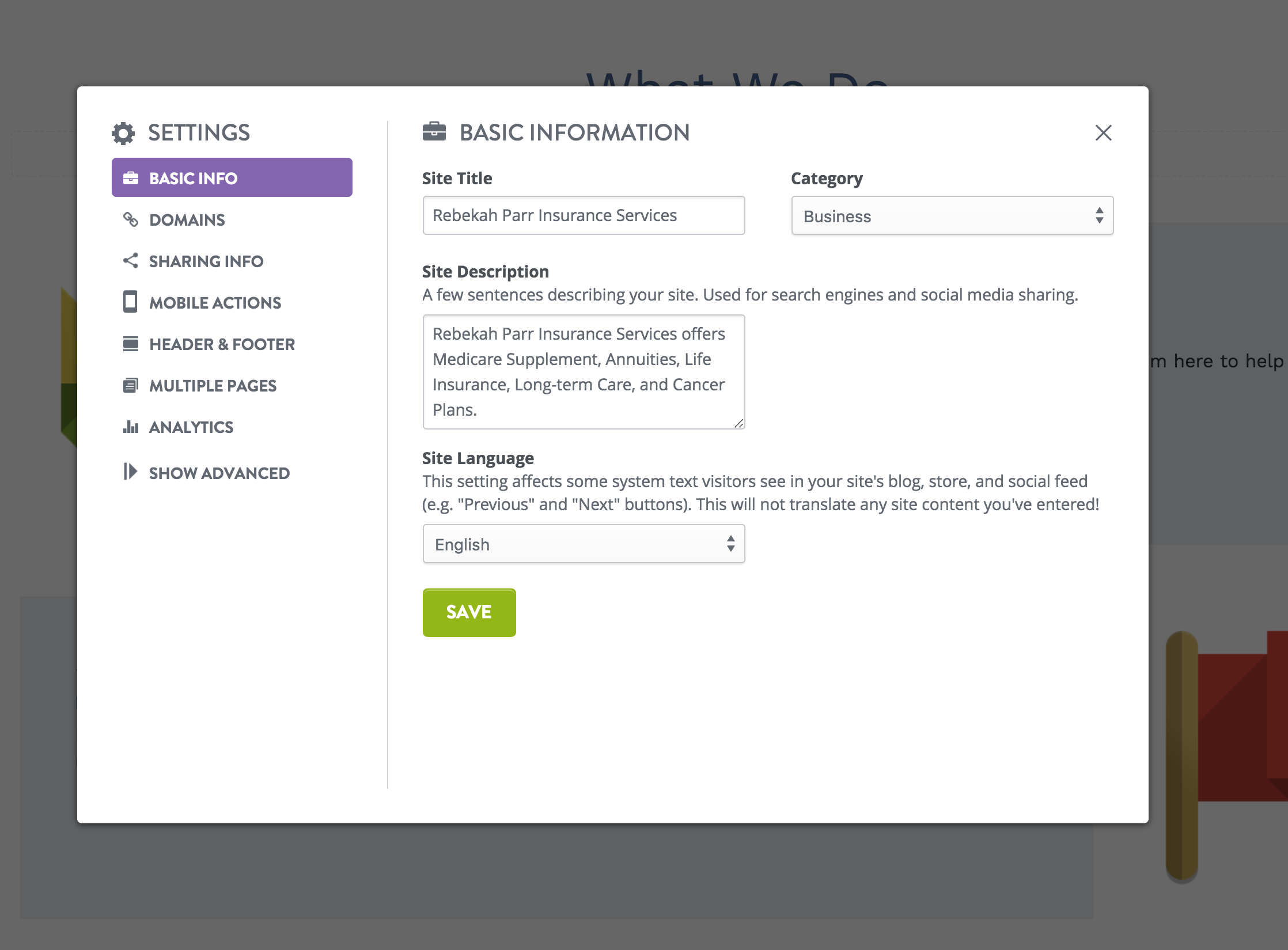
Make the necessary changes in the Basic Info section, and then move through each tab to make similar adjustments.
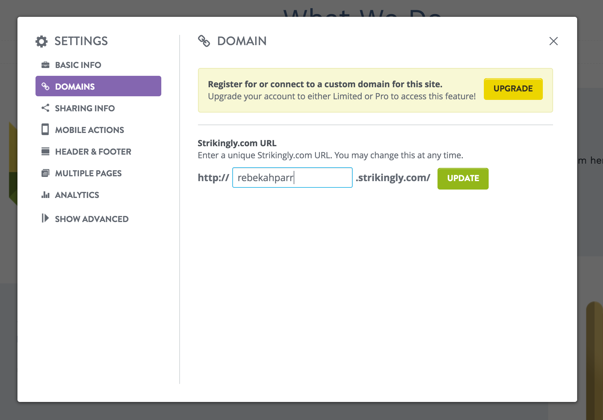
The domain tab is really important as this is what your URL will be. Notice that with the free version, your URL will have the “strikingly.com” in it. If you want your own domain, you’ll need to upgrade to a paid version.
If you do want to upgrade, these are the pricing options:
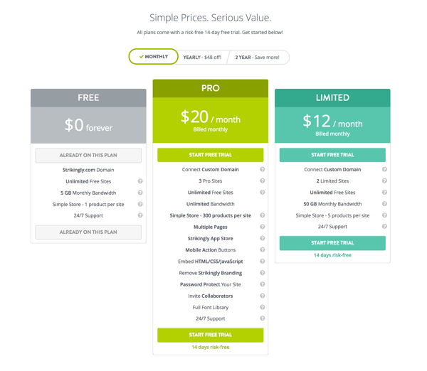
If it’s just the custom domain you’re after, the limited plan would be good enough. If you want those extra features, then pro it is.
Whenever you’ve made your decision, it’s time to go live!
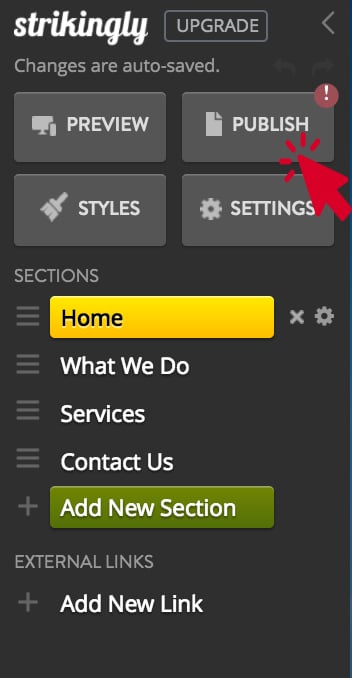
To do this, open up your Editing panel on the left side of the page and click “Publish.”
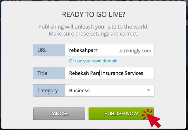
Once you’ve confirmed everything, click “Publish Now.”
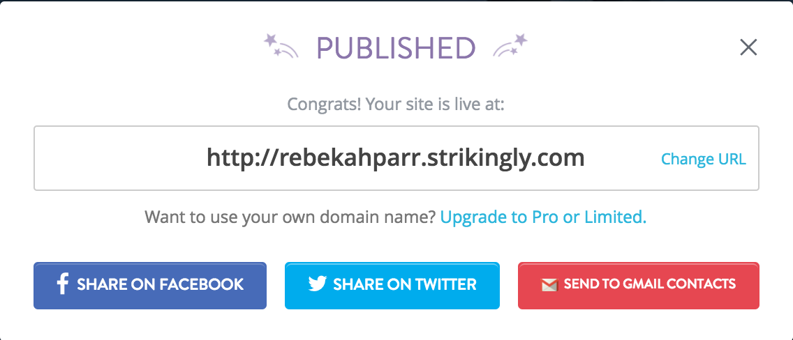
Then you’re done!
Squarespace
We’re moving up in the ranks now – Squarespace is another option that gives you a bit more freedom. It’s more involved than Wix and Strikingly, but it’s still without your reach. We promise.
To get started, go the Squarespace homepage and click Get Started.
Here, you’ll need to choose a website template. This can turn into a few hours of browsing, so I encourage you to sort your options first so you don’t get stuck.
First, choose “Professional Services” from the list of categories.
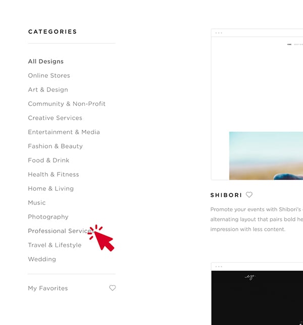
Now it’s time to choose the template that functions the best for your business. You can ignore the templates that are built specifically for other industries (gyms and fashion designers).
Go with your gut on this. Which one catches your eye the most? What do you think your target audience would like the best?
And when in doubt, simpler is better.
If you need a hand, we like the templates named Ready and Bedford.
For this tutorial, we’re going to choose Ready. One you choose your template, create your account by filling in your information.
Then, click START.
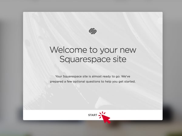
Your website is about Professional Services, so click that button and click next.
The next question will ask about your goals for the website.
Again, this is up to you and what your own goals are, but we would recommend “Collect contact info.” This is essentially collecting leads that you can follow up with afterwards.
This website is for the client, so click that button and move on.
Now it’s time to add some content.
Put your bio into the field, and click next.
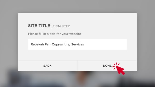
Then, it’s the final step! Fill in a title for your website. This can put you in a bad place if you don’t make a decision.
We recommend doing something simple and explanatory. For example, I might put Rebekah Parr Copywriting Services.
If you have an agency name, use that here.
Then, hit DONE.
Now, it’s time to change the existing content to match your business.
To get started, create your first page. You can do that by simply trying to Edit the text. Squarespace will prompt you to add the homepage. Then, start changing the text and put in your own images.
If you don’t have any images of your own, you can always download free stock images from places like Burst or FreeImages.
I’m going to make some changes, and I’ll be right back.
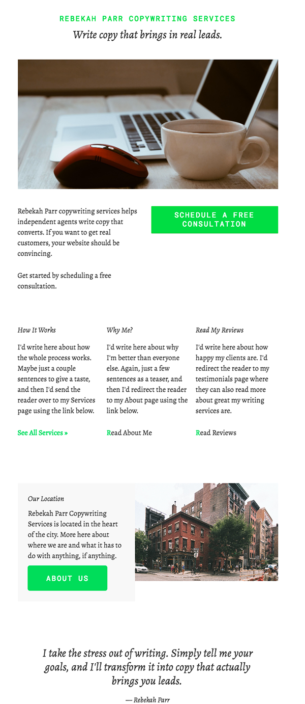
Now that I’ve finished changing things on the home page, I need to do the same thing for the other pages I want.
You can make your changes by clicking on the left-hand menu and by navigating to each page.
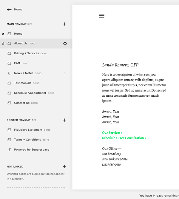
You may also notice that you have the option to completely change the design and view your analytics. This freedom allows you customize your site exactly how you want it while also keeping a close eye on how it performs.
Another really cool feature that Squarespace offers is a logo design generator. You plug in the name of your business, choose an icon that represents it, and boom – out pops a logo. You can try it out here: https://logo.squarespace.com/.
Once you’ve made your changes, it’s time to enable your website. All you do is click on that “Upgrade Now” button at the bottom of the page.

Here, you can choose between a personal plan or a business plan.
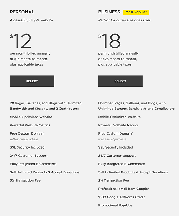
If you choose to go with the Business plan, the payment is annual, so you need to pay $216 up front.
That’s it! Now you have a completely customized website that’s ready to go.
WordPress
Until now, every option on this list has involved a middle man. You use their platform to create your website, you pay them a monthly fee, and they take care of all the junk associated with having a website.
However, using WordPress is the way to get around the middleman and have full control of your site.
One of the best parts about WordPress is that it’s the world’s most popular CMS – 75 million websites use it.
This means there’s a lot of support, a lot of features, and tons of ways to make your website beautiful and functional.
In order to build a WordPress website with zero coding skills required, you’re going to want a front-end page builder. Before 2014, these didn’t even exist, but now, there are a good amount of them on the market. Four have really floated to the top in terms of support, functionality, and innovativeness. Those are Elementor, Divi, ThriveThemes, and BeaverBuilder.
Each one is slightly different, but they all accomplish the same thing – you can build your website with a drag-and-drop builder.
Simple as that.
Feel free to look at each one in depth if you want more information, but for the sake of this tutorial, we’ll just choose one, Divi, and show you how it works.
Using the Divi Builder
Divi enables you to edit your website from the front-end. This means that instead of piecing together HTML code, you can see what the final product would look like while you make changes.
In order to do start creating your website, you need to get your domain, and you need to host it.
This might sound confusing, but don’t get stuck on the lingo.
You can choose your domain (the URL for your website; ex: www.newhorizonsmktg.com) and hosting through any of these companies:
- GoDaddy
- HostGator
- Bluehost
There are many more out there, but these are generally the most popular ones. Once you’ve chosen your domain, go to the hosting section and add the wordpress application. Once that’s installed for the domain you’ve chosen, you’ll create a username and password. Within 24 hours, WordPress should be installed to your hosting account.
When you login to your site, you should be taken to the WordPress dashboard. Here, you will import the website builder you’ve chosen. The website builder will have instructions on exactly what to do, but in general, you’ll add the zipped file to the Themes section.
From here, you can begin customizing your website. The Theme Customizer lets you choose the fonts and colors you want, what the buttons should look like, what the navigation looks like, how your menu bar is set up, and so on.
You can also see what the site looks like for desktop, tablet, and mobile.
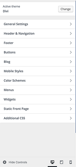
Once you’ve chosen the settings for your site, go back to the WordPress dashboard and start adding your pages.
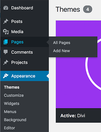
For example, if you want a Home page, an About page, and a Contact page, you’d add those here. Divi also comes with pre-made layouts, so if the thought of making a web page from scratch cripples you, you have a starting point.
Simply add the page, open up the Visual Builder, and you can edit the page directly without touching any HTML.
For the purpose of this example, we’ll make an About Us page using a pre-made layout. You can choose a layout from the purple bar at the bottom of the page.
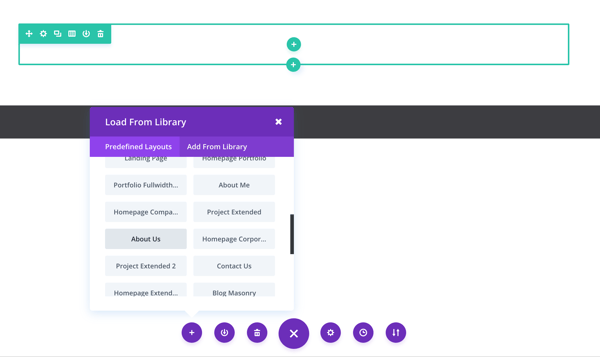
I’ve chosen the “About Us” layout, and there’s now a full page where I can just fill in the missing pieces.

Remember that the website builder you choose will have a ton of resources for you, from setting it up to customizing it. This is just a brief overview, so if you have questions, don’t feel overwhelmed.
The great thing about WordPress and a website builder is that it’s extremely customizable. Pretty much anything can be done with WordPress, and you have the added benefit of its popularity. There are tons of plugins, support, and resources out there.
When you break down the costs of going this route, it’s about $160/yr.
- Domain cost - Around $20/yr
- Hosting cost - Around $50/yr
- Website builder - Around $90/yr (one-time payments are also available, usually in the $200-$300 range)
No matter what stage of your business you’re in, there’s a website building option out there for you.
We’d like to know – do you have a website? If so, what did you use to build it?


