Twelve cups of coffee, 570 LinkedIn profiles, and 50 websites later, and it’s here.
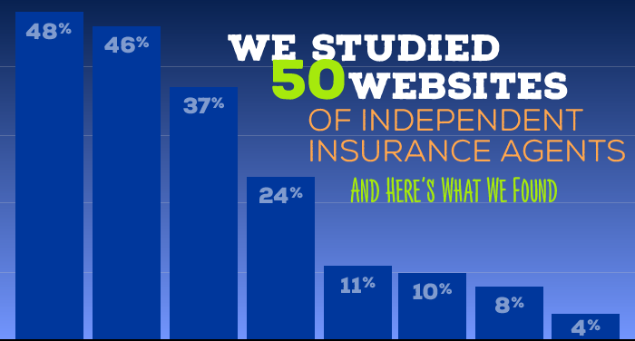
We studied 50 websites of independent insurance agents, and we found that things are looking a bit gloomy.
You’ve probably heard us preach that having a website is pretty much mandatory in this day and age. But our research tells us that you probably don’t have one.
In fact, out of every 100 agents on Linkedin, only 9 agents have a website. Well, technically, a little less than 9 agents (8.8%).
And I’m assuming that if you’re on LinkedIn, you may be more inclined to have a website. So that number is probably lower. If that’s even possible.
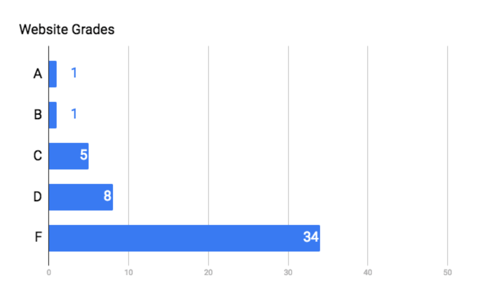
And what’s more, 34 of the 50 websites we studied scored an F in actual effectiveness.
So, if we’re going to talk about agent websites that are actually useful to the consumer, well… only 2.8% of agents are on the right track.
Which means we have 97.2% to go.

It may feel like an unimportant little thing at the end of your to-do list, but trust me — it’s a huge, glaring mistake that’s costing you leads.
Actually, don’t trust me. Trust the stats.
- 91% of consumers have made the next step in the buying process because of an online experience.[1]
- Having a website, next to Facebook Ads, is the most cost effective marketing method.[2]
- 97% of consumers research a product or service online before buying.[3]
- 88% of consumers have been influenced by an online review.[4]
- 67% of businesses are using their website to market to their customers.[5]
It seems to me that not having a website is costing you more money than you thought.
So… How Did We Do?
I mentioned that 34 of the 50 websites we researched flunked out.
In our study, we measured the website’s success with 20 different elements, and each element is worth 1 point.
And here’s how the lucky 50 sites did:
And every teacher cringes.
Yikes.
The Ideal Agent Website
After much reflection, debate, and research, we chose 20 elements to measure that make up an ideal agent website.
They can be broken down into 4 main categories: functionality, appeal, content, and connection.
- Is the website mobile-friendly?
- Is the loading time 5 seconds or less?
- Is the navigation user-friendly and straightforward?
- Are the fonts readable?
- Are the pictures and graphics clear, appealing, and appropriate to the topic at hand?
- Is the copywriting appropriate, free of errors, and appealing to consumers?
- Is the design generally appealing? I.e: Not overwhelming, simple, and modern?
- Is there a description of service?
- Is there an About page?
- Is there a photo of the agent?
- Are there any custom-made videos?
- Are there links to social media?
- Is there a FAQ/SAQ page?
- Is there a blog or some type of helpful, written material?
- Are there testimonials or reviews?
- Is there a Contact form?
- Is there a Request a Quote button?
- Is the visitor’s email collected?
- Is there an auto-response when the visitor’s email is collected?
- Is there a calendar to schedule an appointment?
Our research indicates that these categories are really important to have if you want an effective, user-friendly website.
So, let’s take a look at our findings.
Functionality
1. Mobile friendliness
Mobile friendliness… who cares, right?
Well, not exactly.
Google gives you gold stars for having a website that’s compatible with our smartphones. While gold stars are really tempting, Google does this for good reason.
In 2012, the search engine giant conducted some research[6] that indicates the following:
- 74% of visitors are more likely to return to mobile-friendly websites
- 61% are likely to leave if a site isn’t mobile friendly, and
- 67% are more likely to buy at a mobile friendly website.
And since Google rules the world wide web, they have a nifty tool you can use to see if your site is indeed compatible with my iPhone.
Simply go to → google.com/webmasters/tools/mobile-friendly/ ← and paste your website’s URL into the box.
Here’s an example of a website that is not optimized for mobile use:
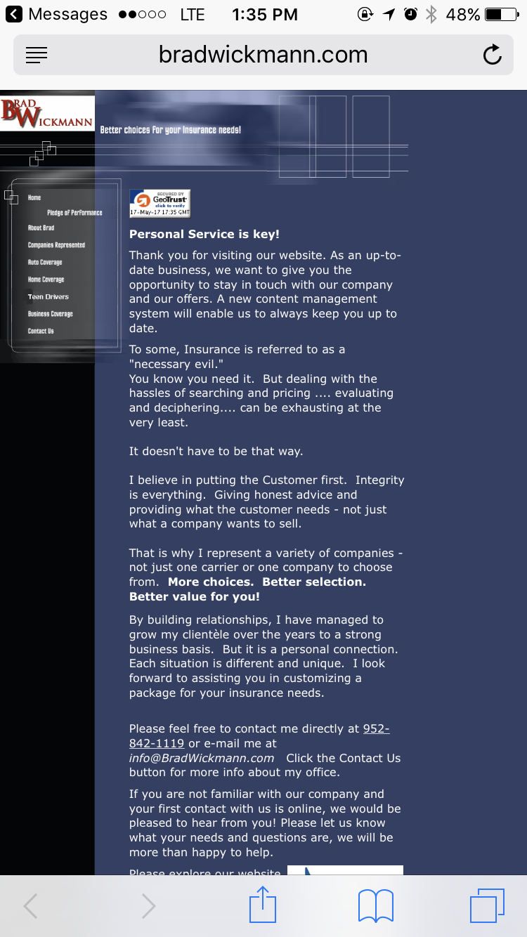
It’s really hard to see the text on the screen, and it’s nearly impossible to tap on one of the menu options to the left. They’re way too close together. And nothing is more infuriating than trying to get to the About page and ending up on the Privacy Policy.
Here’s an example of a website that is optimized for mobile:
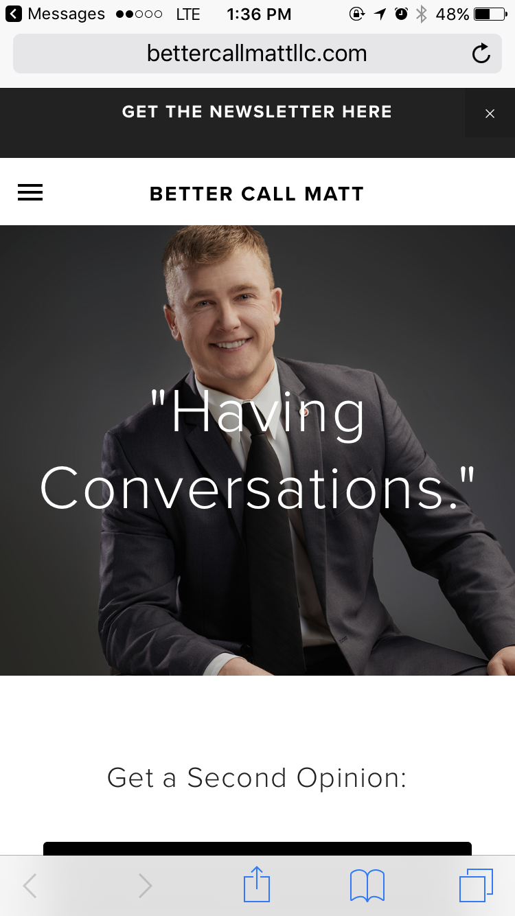
You can read all of the words on the screen, and the handy menu button in the upper-left makes it easy to navigate the menu items without clouding up the screen.
And for the moment we’ve all been waiting for: how did our 50 sites do?
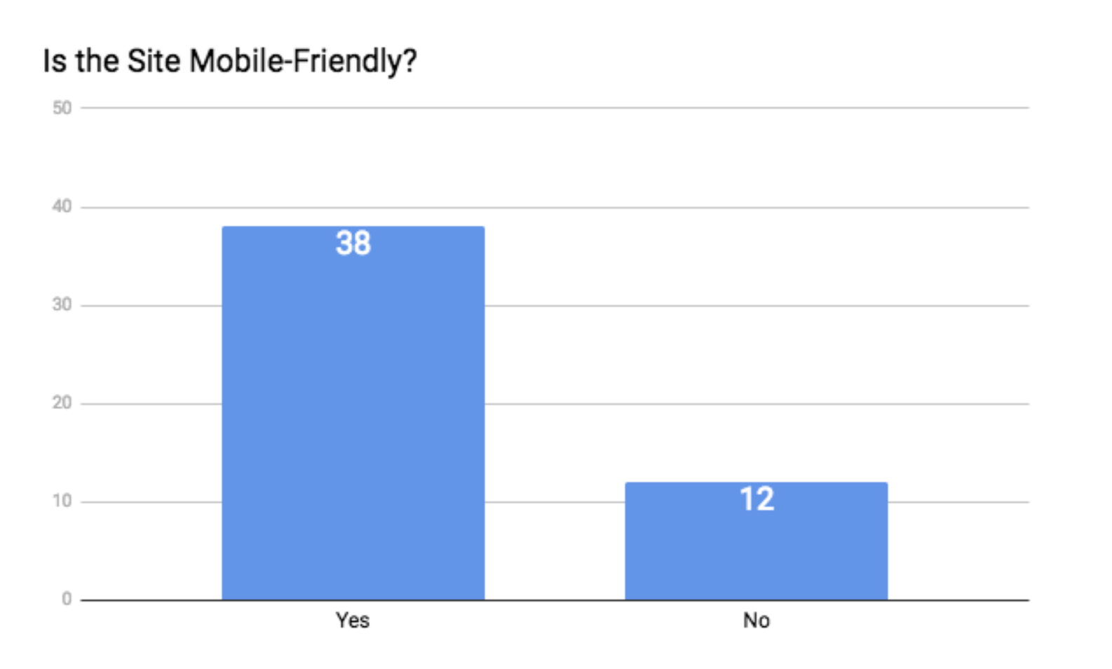
Not bad at all. 38 of the 50 sites are mobile-friendly.
2. Loading Time
Have you ever gone to a website, waited, nothing happened, you waited some more, you decided to go grab a cup of coffee, you ran to Publix for a breakfast snack, you came back, nothing was loaded, you refilled your coffee, started watching that new Netflix series, came back, saw a sliver of the homepage start to appear, grabbed some popcorn, waited some more, and…
Yeah, me neither.
Your loading speed is a killer. If it takes your website more than 5 seconds to load, your potential customers are extremely likely to jump ship.
To put a number to it, around 39% of people will stop engaging with a website if images won’t load or take too long to load.[7]
Yeah, no thanks.
To see how fast your website loads, plug your URL into the box on this website: www.gtmetrix.com.
Not only will it tell you how many seconds it takes, but it will let you know what the holdup is if there’s an issue.
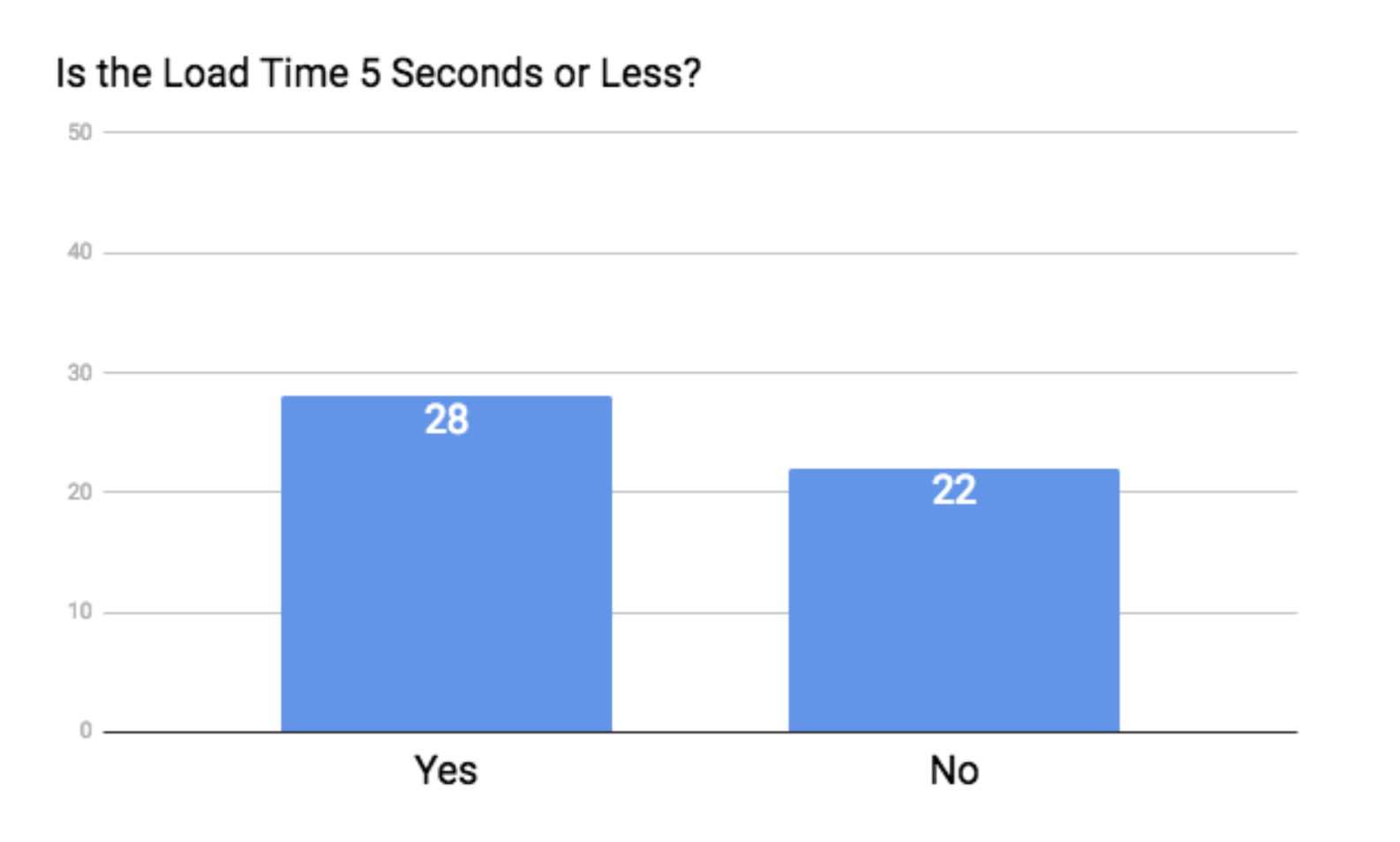
As for our famous 50, load time proved to be a bit of a hit or miss with just over half of the sites loading in 5 seconds or less.
3. The Navigation
Have you ever been to a home that had a less-than-ideal layout? Perhaps you had to walk through someone’s bedroom to get to a bathroom, or maybe you can’t open the fridge door all the way because it’s too close to the wall.
Well, same concept goes for your website’s layout.
Bad navigation is flat-out infuriating. And detrimental to the entire point of your site.
When a potential lead visits your site, half of them will use the navigation menu to orient themselves.[8]
And I think we all know what people do when they’re confused, can’t find what they’re looking for, or are slapped in the face with bad nav.
They run.
A few quick tips from the pros are:
- Avoid drop-down menus.
- Limit your main menu to 7 items or less.
- Put your navigation in an expected place (the top of your site is ideal).
- Don’t use generic labels for your menu items (ex: instead of “products,” say “insurance products”).
Here’s an example of a website with bad navigation:
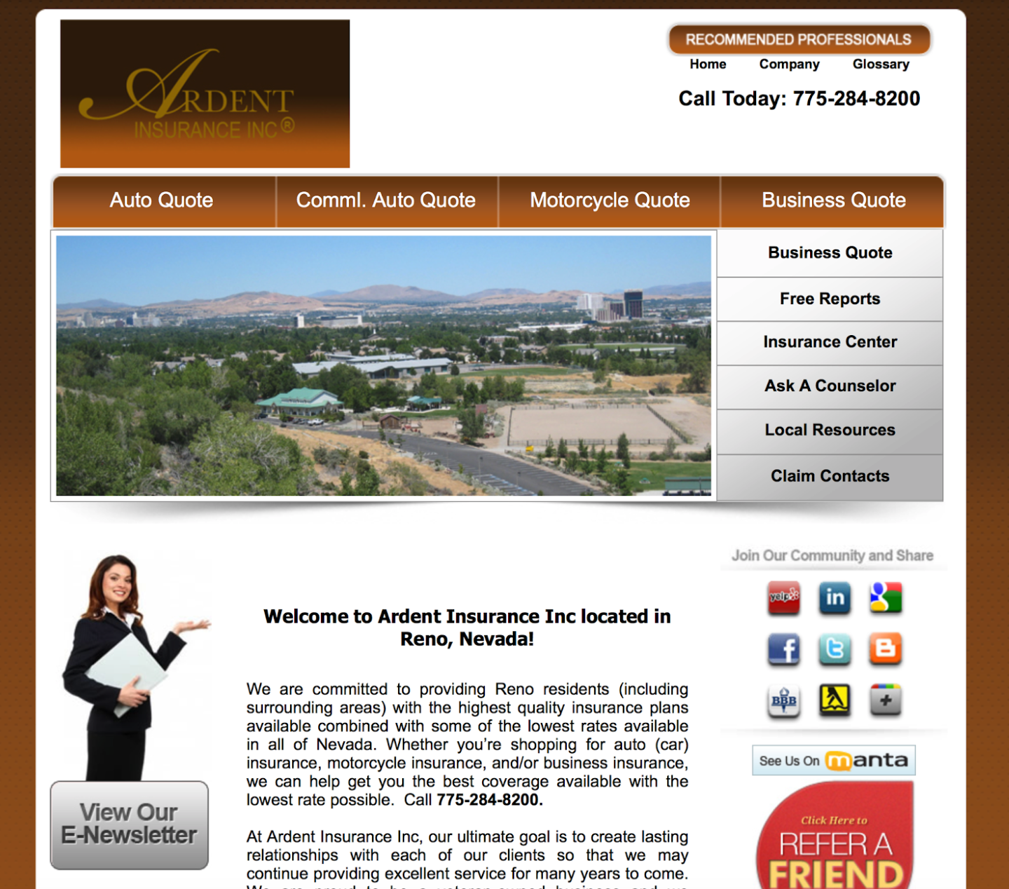
When you look at this site, you’re not sure what’s going on. It looks like there’s a small menu in the upper-right, another menu a little below that, and yet again, another menu that’s vertical.
When we scroll down to the bottom of the web page, we see even more navigation items.
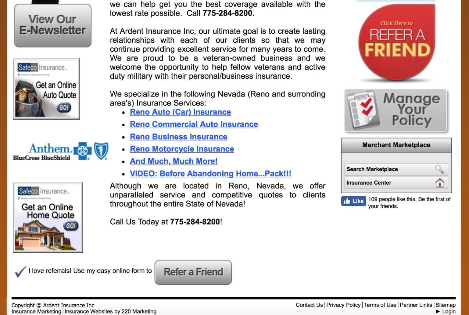
Everything is scattered and confusing, which makes it really hard for a visitor to figure out what to do or where to go.
On the contrary, here’s a site with great navigation:

In the top right corner, we see 5 menu items: Home, About Us, Insurance Products, Blog, and Let’s Talk.
If we scroll down to the rest of the page, we see some more navigation items, but they’re neatly presented and aid us in the navigation process (rather than confuse us).
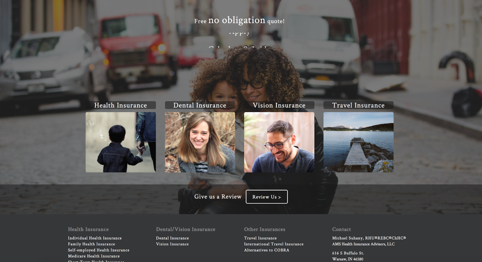
It’s clear to see how the first example could deter visitors, while the second example encourages them.
So… how did our famous 50 do?
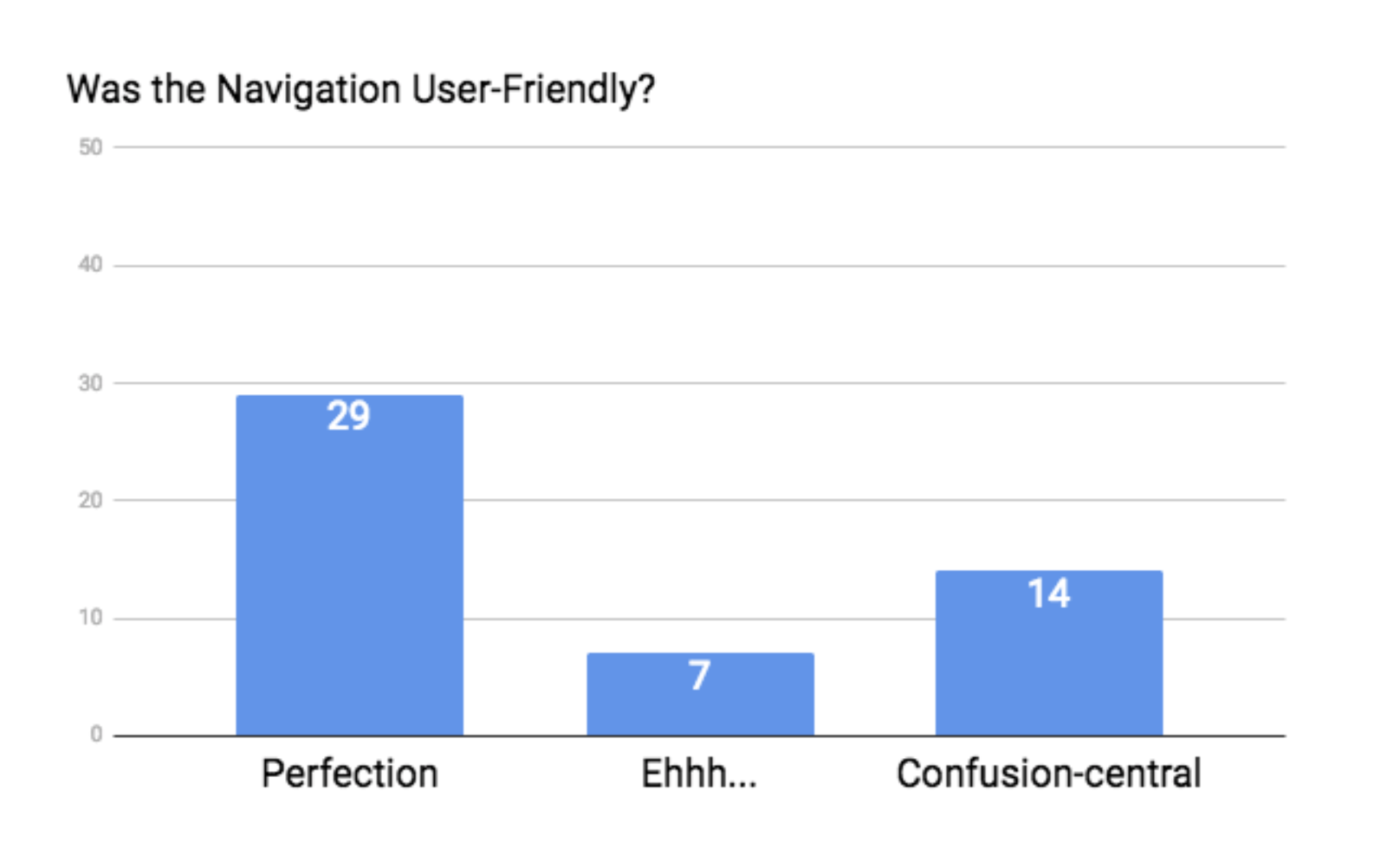
Again, not too bad. Twenty-nine of the sites had navigation that worked well, 7 had navigation that was functional but could be tweaked a little bit, and 14 of them were downright confusing.
Appeal
4. Fonts
There’s no doubt that everyone has a different opinion of which fonts are more appealing than others, so we decided to keep this category as simple as possible.
If you can’t read the fonts, then you don’t get a point.
That’s it.
Thankfully, our famous 50 didn’t do too bad in this category.
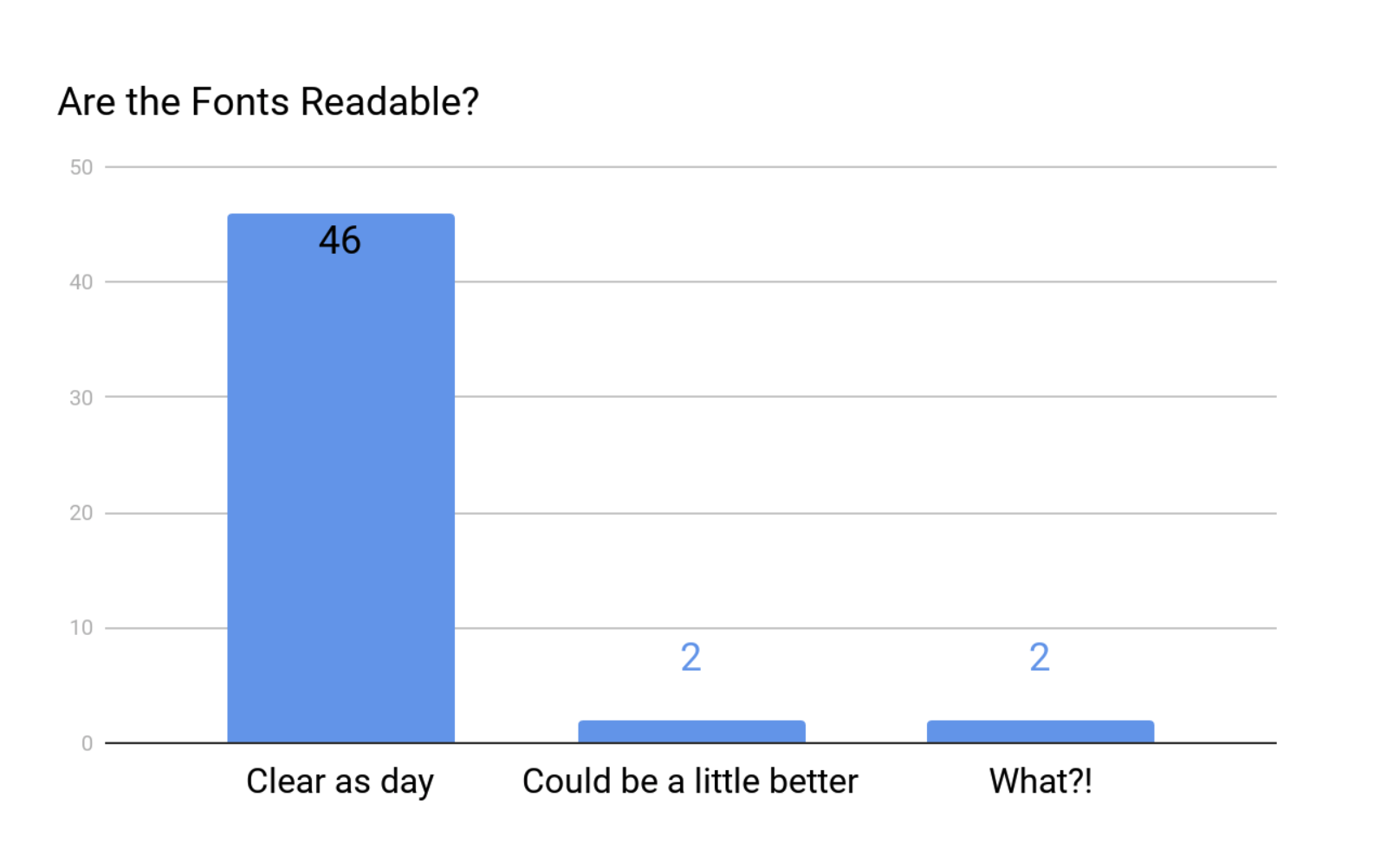
46 of the sites had no problem, 2 need a little love, and 2 were downright unreadable.
Here’s an example of a site with fonts that could be improved.
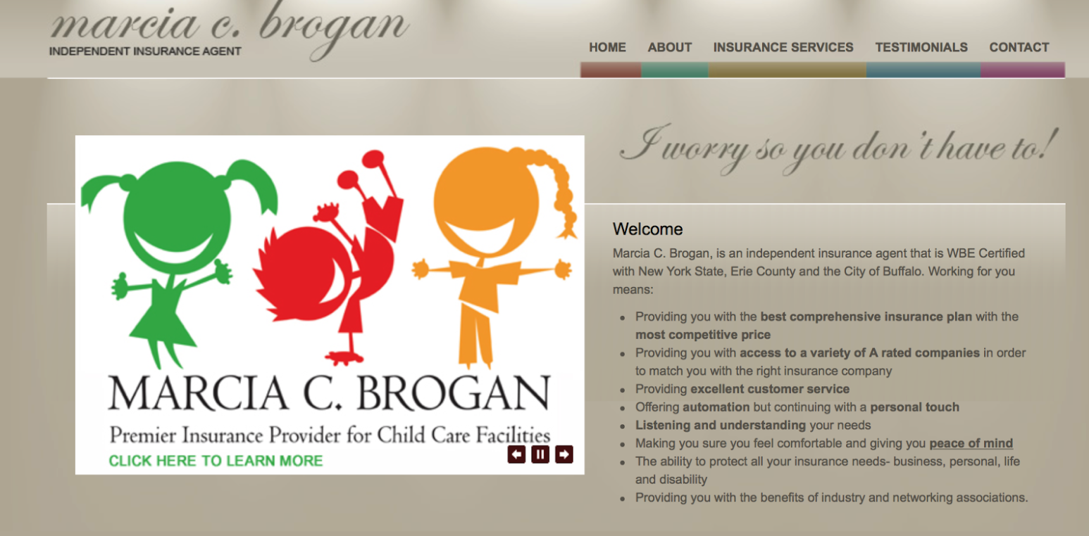
As you can see, the color of the text is only a couple shades darker than the background. It makes it really difficult to read the words.
And here’s an example of a site that needs a total font change.
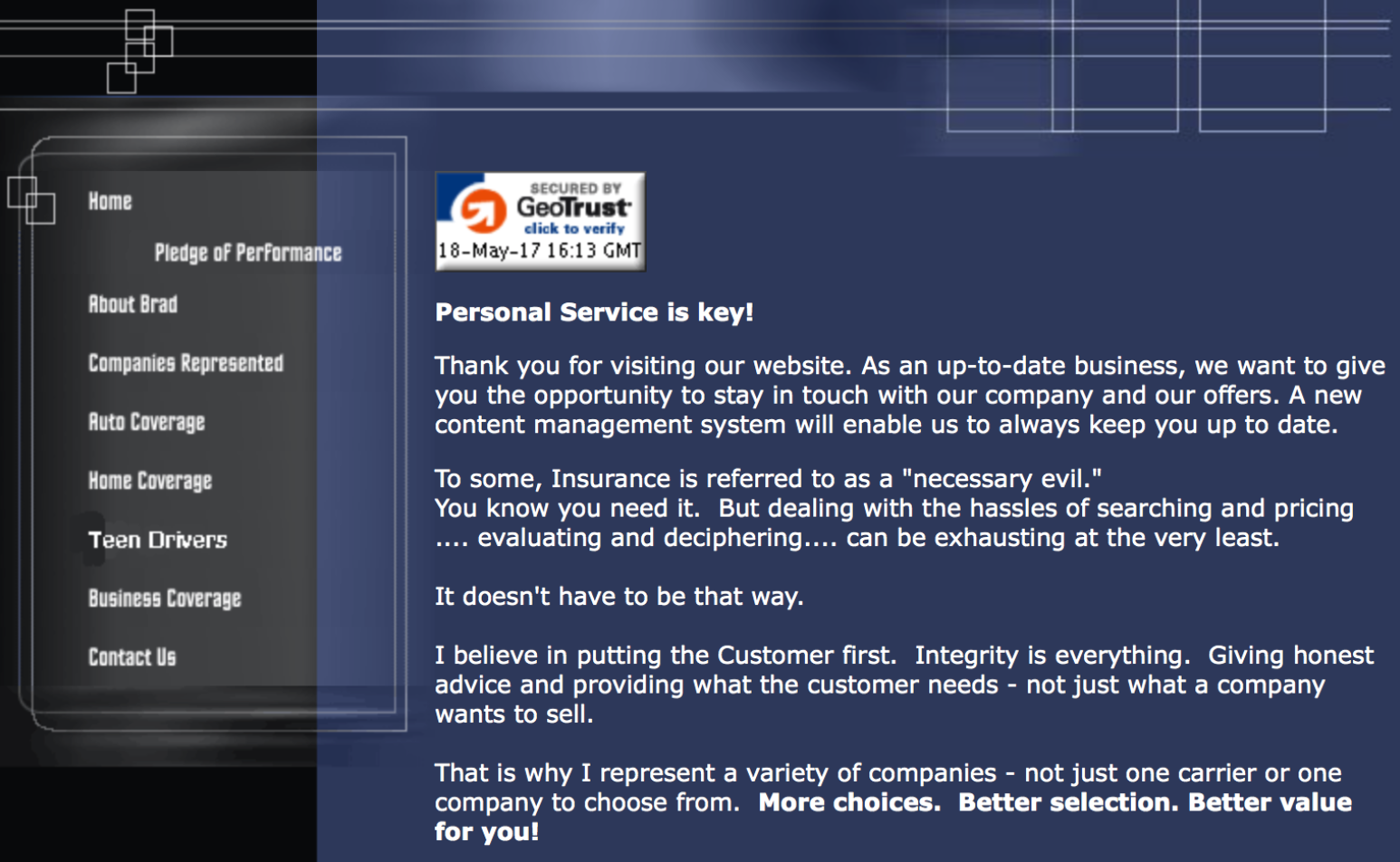
This is the same site that was not optimized for mobile, but even on a desktop, you can barely read the menu items. The font is too small, and the letters are too close together.
There’s not much else to say about fonts other than… well… make sure you can read them.
5. Pictures and Graphics
Again, it’s really hard to measure the elements that have to do with appeal. Everyone has a different idea of what’s appealing, but there are some general guidelines that everyone can agree with.
We want the photos to be clear, we want them to be appealing, and they should be appropriate to the topic at hand.
So, any images that are blurry, make me cringe, or have nothing to do with the site don’t get a point.
It’s also interesting to note that many digital marketing experts out there preach against using stock photos. They’re expected, many look very outdated, and they don’t feel personable.
So, if you can, try to use your own images, or opt for graphics that have a more modern, original feel.
If we’re being honest, you know you’ve seen this stock photo at least 50 times.

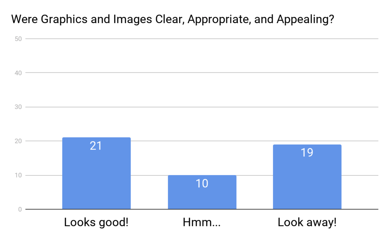
Anyway, here’s how the 50 sites did:
An example of a site with a great photo:
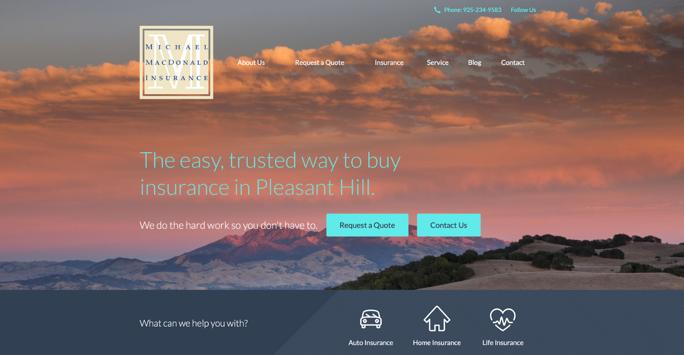
And an example of a site with… well, not-so-great photos:
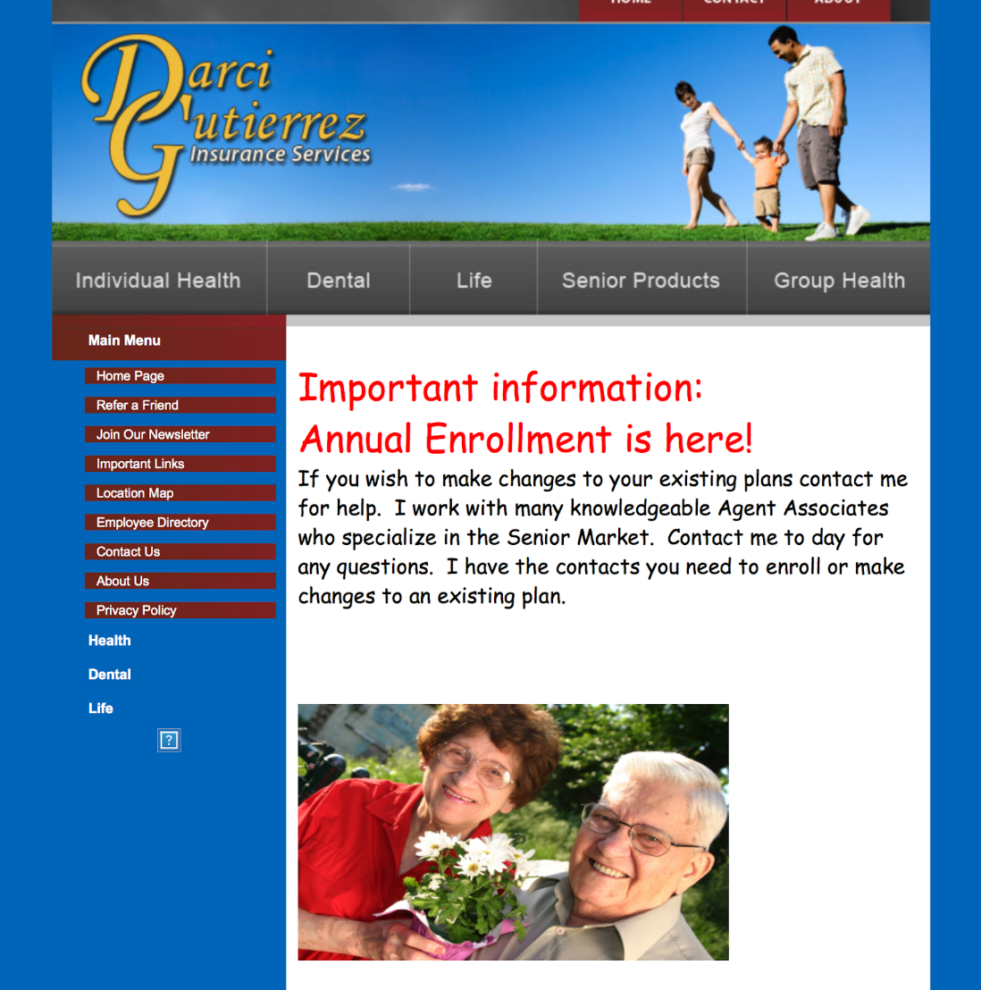
As you can see, there appears to be an image that’s missing under the left-hand, vertical menu, and the image in the middle of the page appears to be stretched.
The photos do look a bit dated, as well.
Alright, moving on!
6. The Writing
As the resident copywriter for New Horizons, this section holds a special place in my heart.
I was tempted to be an evil grammar teacher, but don’t worry. I kept my expectations realistic.
While there’s a LOT to know about effective copywriting, not every business owner wants to go through years of training.
So, we kept it simple with the following requirements:
- The copywriting needs to be appropriate.
- It needs to be free of errors.
- It needs to be appealing to consumers.
In other words, we’re deducting points for run-on sentences about where your kids went to college, what sports they play, and what they’re doing these days.
Customers want to find information about insurance, they want it to be professional, and they want to be delighted.
Here’s an example of well-written copy.
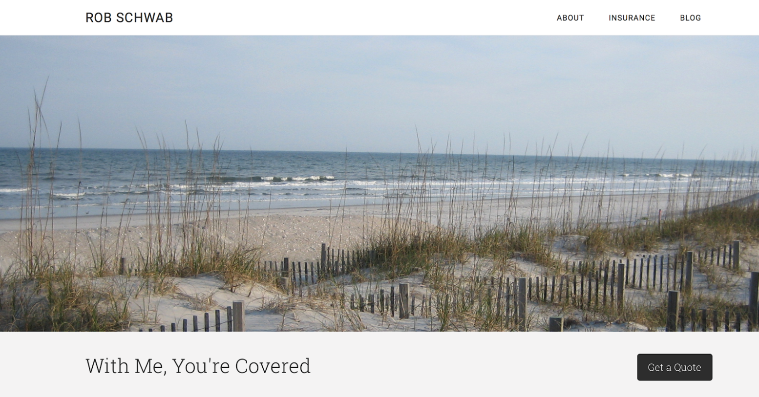
I know what you’re thinking. “With Me, You’re Covered?”
My four-year-old could’ve written that. And… you’re probably right.
But the thing about effective web copywriting is that less is more.
People aren’t sitting down with their favorite Stephen King novel, you know? They’re trying to quickly find information, and you can bet your last dollar that they’re quickly skimming around for it.
The ultimate goal is to get your message into as few words as humanly possible.
Without going too far into this subject, I’d like to touch on one more thing that’ll be really useful for you.
Paragraphs need to be short.
You may have noticed that there are no lengthy paragraphs in this article. And that’s by design.
When you break things up in this way, people are more likely to actually read it. So our writing needs to reflect the fact that people are skimming, and that attention spans are short.
If you want a true gold star, you’ll write short paragraphs with the important bits in bold (see what I did there?).
Here’s a great example of this:
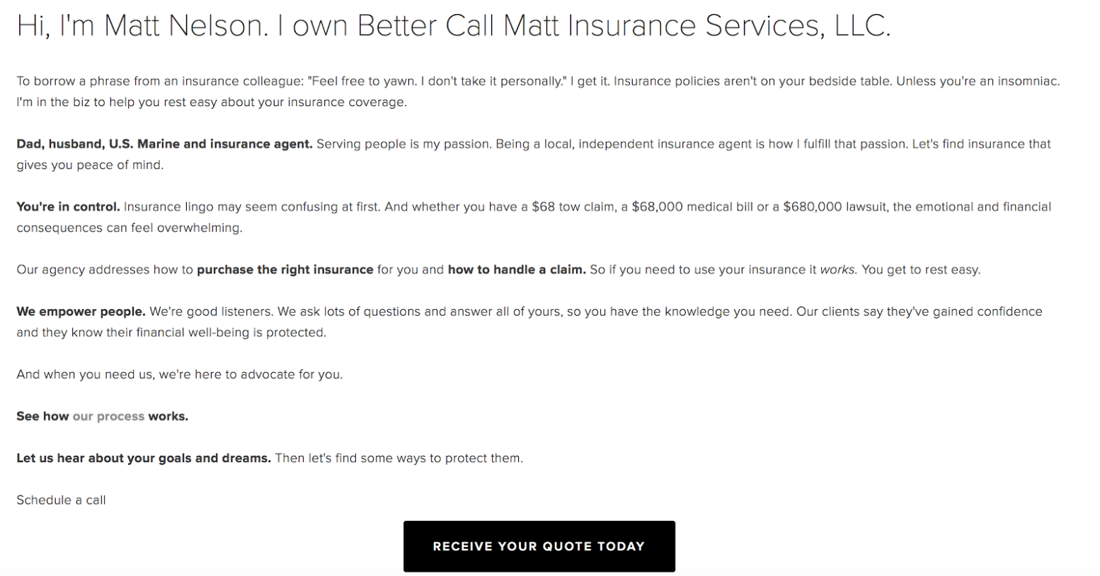
The paragraphs are short, and the bold parts draw our attention. In other words, we’re more likely to leave this page with a better understanding of the message Mr. Nelson is trying to convey.
So, here’s how the famous 50 did.
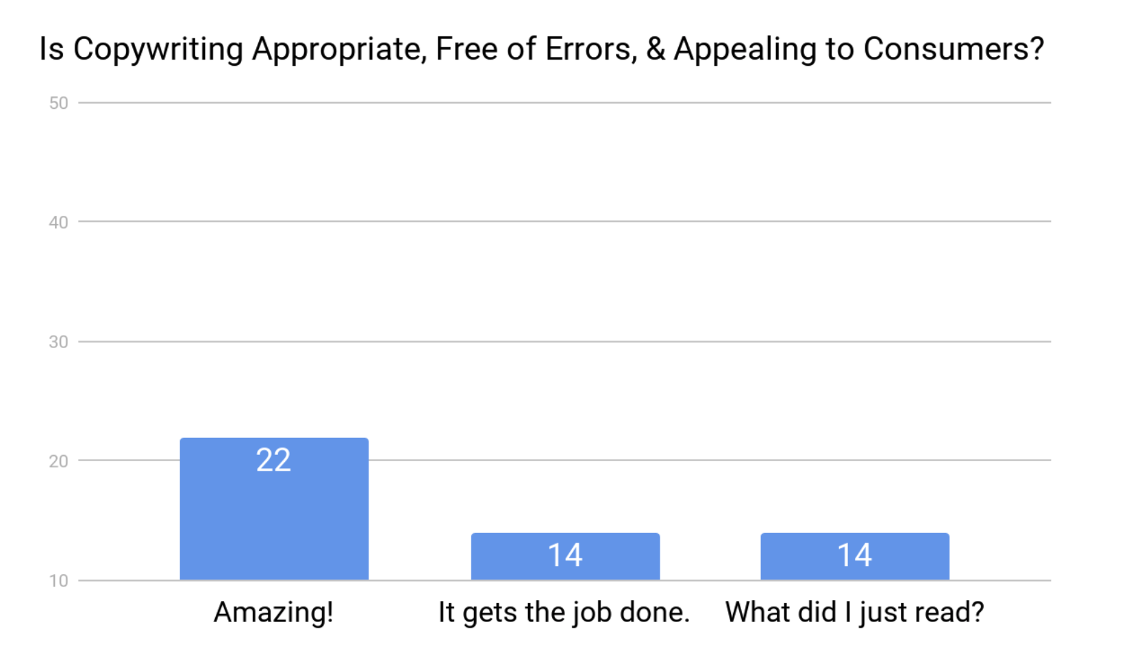
And to indulge those of you that want to see the worst in every situation… well, here are some of the weirdest bits of copy I came across.

I… tuned… out… a… long… time… ago…

This provides zero value to the visitor.
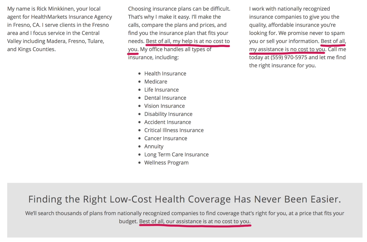
So… do I have to pay for this?
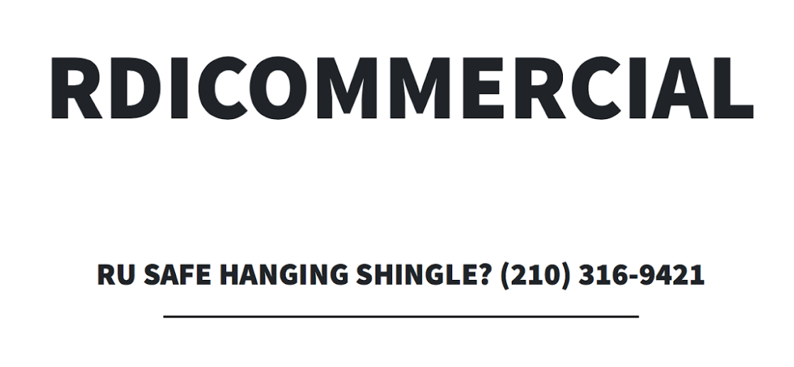
Um, what?
7. The Design
Basically, if the website made me grimace, it didn’t get a point.
I’m kidding. Sort of.
In general, the design of the site should be somewhat appealing. That word could mean anything, so we narrowed it down to simple, modern, and not overwhelming.
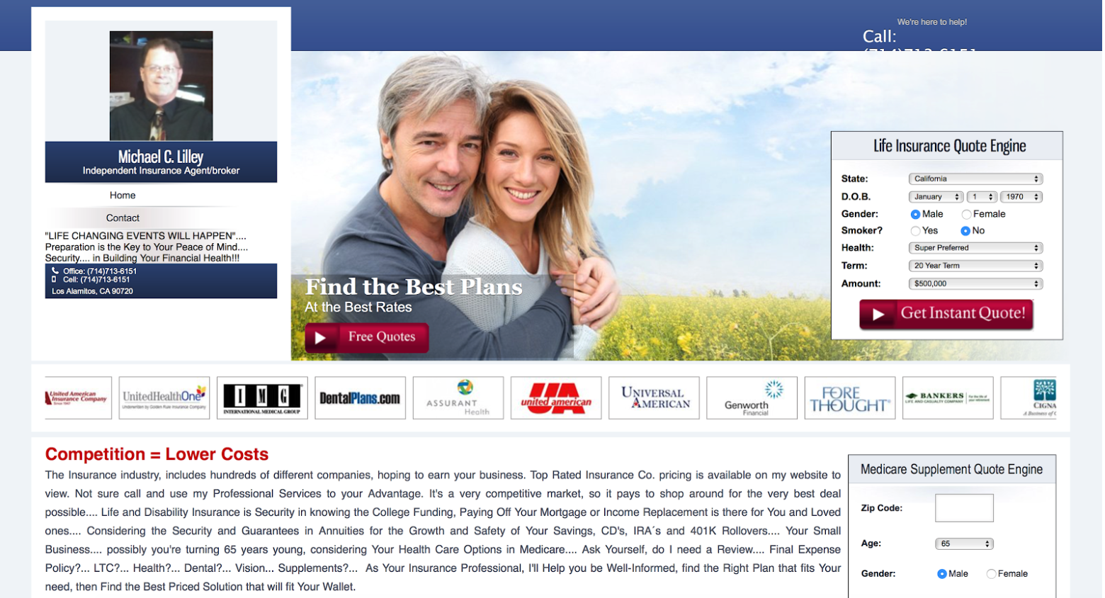
Some sites stood out more than others, but most of the sites could use a little bit of help:
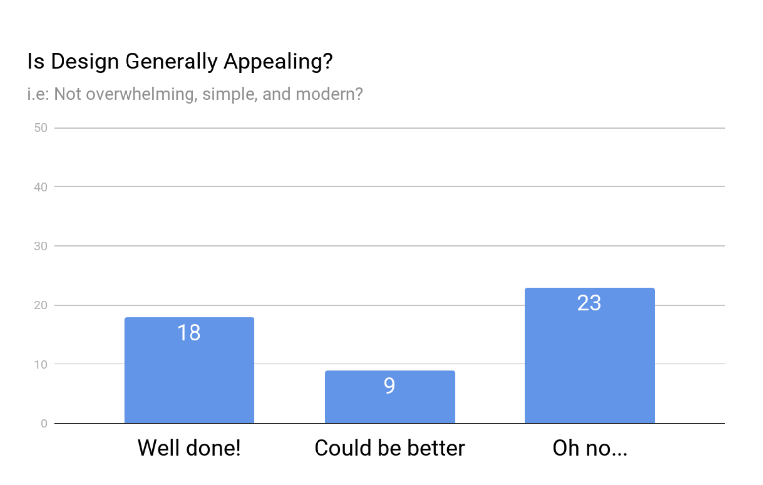
The following site landed on the naughty list, and you can probably see why:
Here’s another one that left us confused:
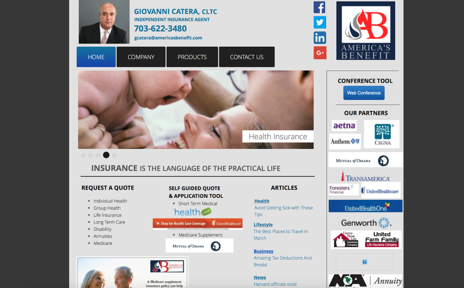
Both of these examples show that more is truly just more.
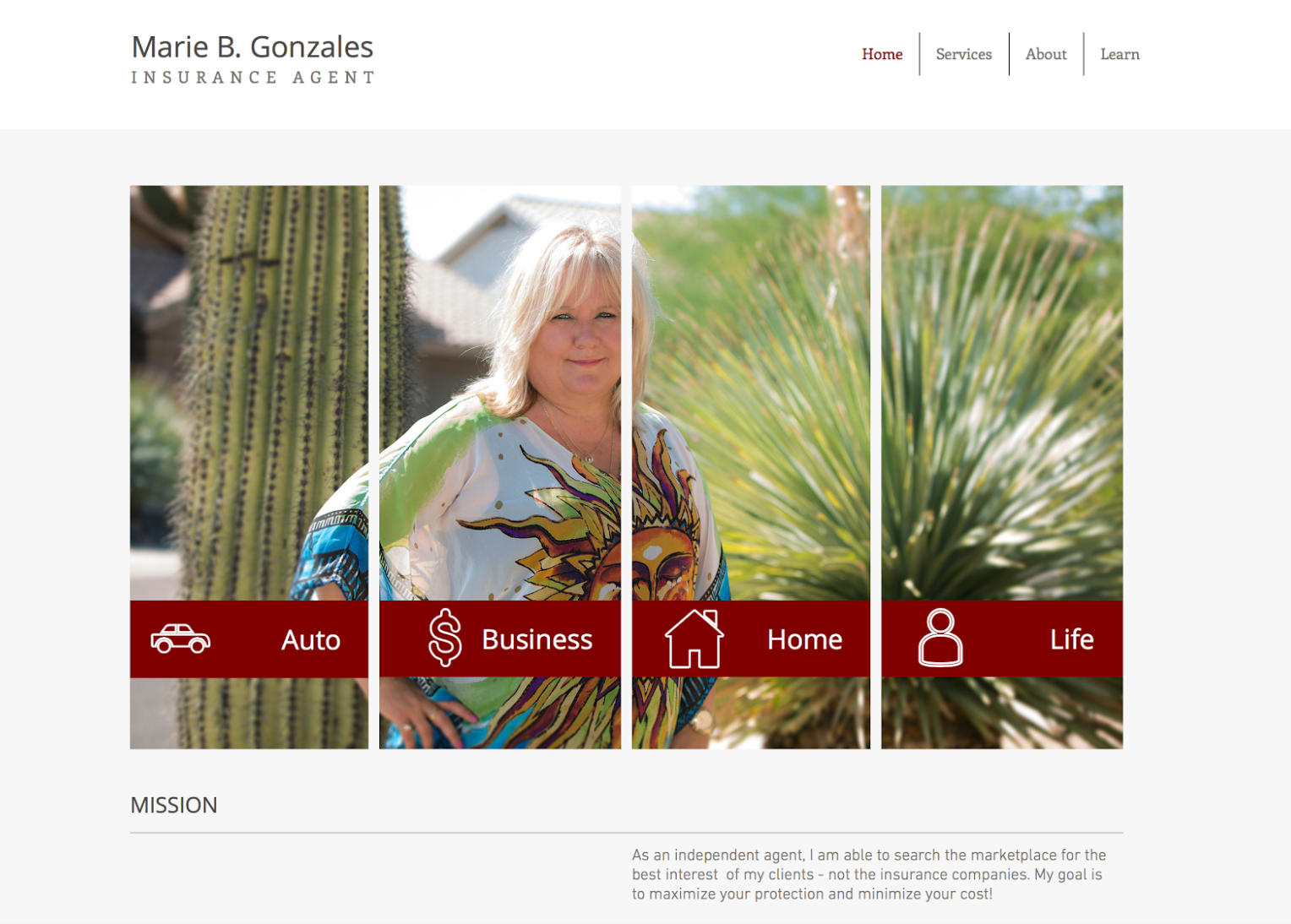
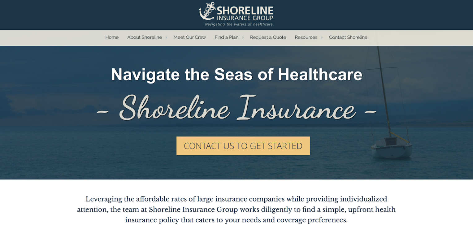
Make it easy for your visitors by simplifying your design.
Here’s an example of a design that’s simple and appealing:
And here’s one more for good measure:
OK, we’re done with appeal, and we’re moving on to content.
Content
There are certain elements that every great insurance website should have. When you’re considering what elements to include, you need to think like a consumer.
Consumers that are in the market for insurance want to quickly find out what types of insurance you sell, who you are, why you’re the best person for the job, and answers to their questions.
As you’ll soon see, the 8 content elements in this section fulfill those desires.
8. Description of Service
I hate when I go to a website and can’t find a description of service.
I want to know exactly what your business sells, and I want to know it right away. It should be on the home page, and it should be seen above the fold. That just means that I shouldn't have to scroll down to figure out what you do.
Now, I wasn’t that harsh when doing the scoring — as long as there was a description somewhere on the site, I awarded a point.
And you’ll be pleased to know that everyone got a point for this category.
I’m so proud.
9. About Page
If I’m in the market for a big-ticket item like insurance, I want to know who you are, what your credentials are, how many years you’ve been in the business, and everything in between.
That’s where an About page comes in.
People are looking for answers to the following questions:
- Who’s the owner and how big is the business?
- How many years have you been doing this?
- What sets you apart from your competitors?
- What are your values, morals, etc.?
- Why should I buy from you?
There are a lot of other little tips as far as what to include, how personal to get, and so on — and you can research that kind of stuff if you’re interested — but as long as you’re letting your customer know who the heck you are, you got a point from me.
So, how did we do?
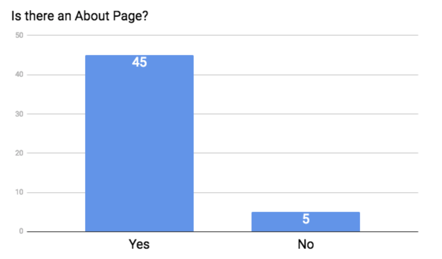
Not bad, friends. Not bad at all.
10. Photo of Agent
In your About page, there should be a photo of yourself, especially if you’re running the show.
It’s in your best interest to put a face to your name.
A fellow copywriter, Susan Greene, explains: “A photo of you ‘on the job,’ will make you seem more real. It’s interesting. And it makes you approachable. Visitors will begin to feel they know you. From there, it’s just a small leap for them to trust you and want to do business with you.”[9]
So, you really have nothing to lose.
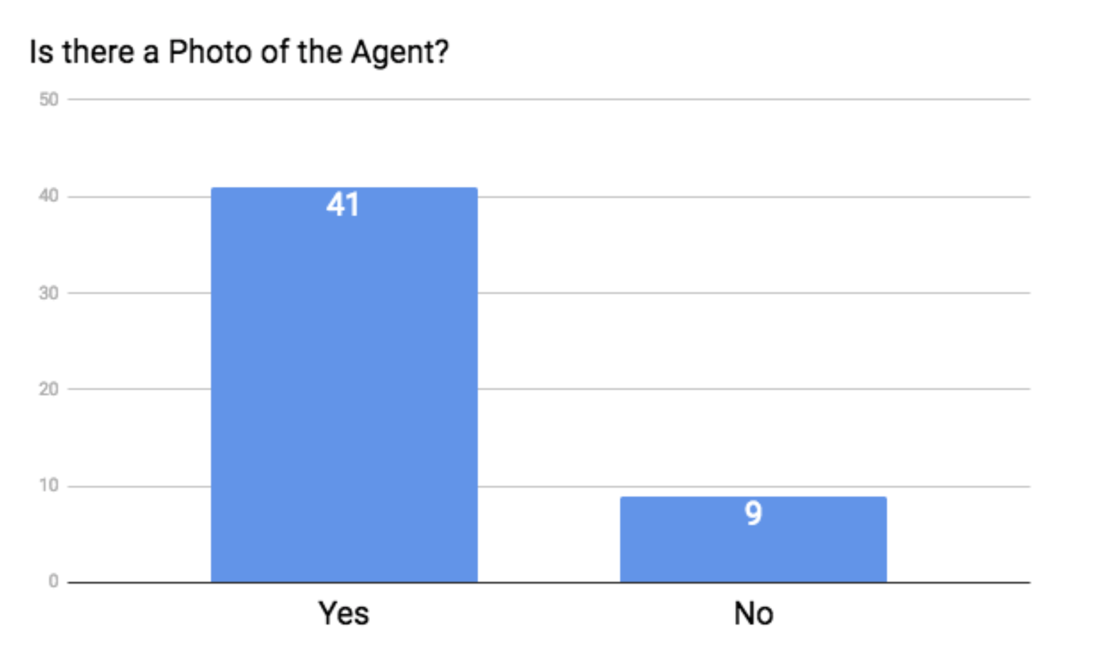
And our famous 50 did pretty well, with 41 of them showcasing a photo.
My only stipulation here is that I beg you to please look semi-happy in your photo, unlike this:

And PLEASE leave your stuffed animals at home:

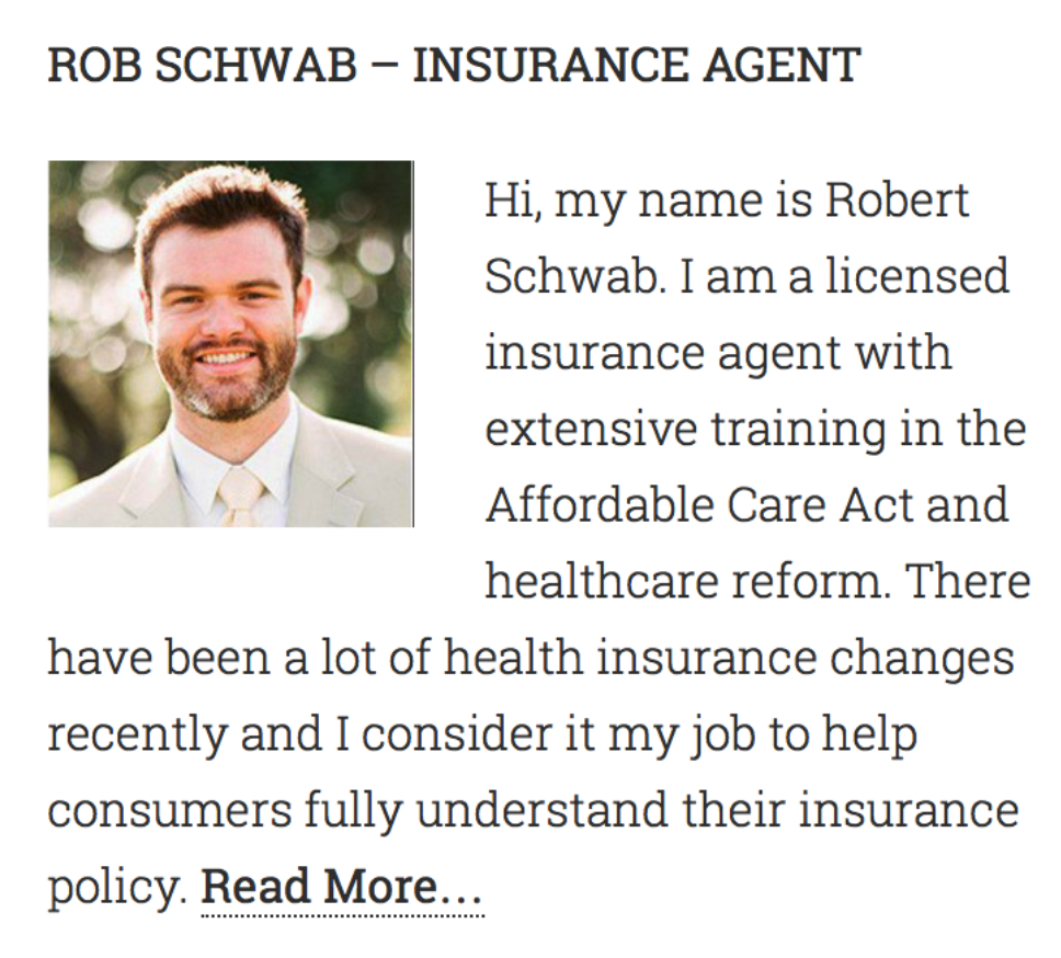
Something like these will work just fine:

11. Custom Videos
While I don’t think this is entirely necessary to have a successful website, it’s certainly an added bonus. And you wouldn’t believe how effective it is.
First of all, Google owns YouTube. So if your site has a YouTube video, Google gives you a boost in their search engine. It’s in their best interest to give you a lift if you’re repping their stuff.
But just as important, consumers like videos.
Including a video on your website’s landing page can increase conversion rates by 80%.[10]
Also, after watching a video, consumers are 64% more likely to purchase a product or service online.[11]
A well-crafted video can accomplish a lot, such as:
- Delivering a message that’s more likely to be consumed,
- Engaging your potential clients,
- Driving more traffic to your website (thanks to higher search engine rankings),
- Giving you and your business a personality,
- Strengthening the relationship you have with your prospects, and
- Standing out from the crowd of competition.
People are way more likely to remember you and actually trust you if they can get a feel for who you are as a person and as a company. And a video is the perfect way to make sure that happens.
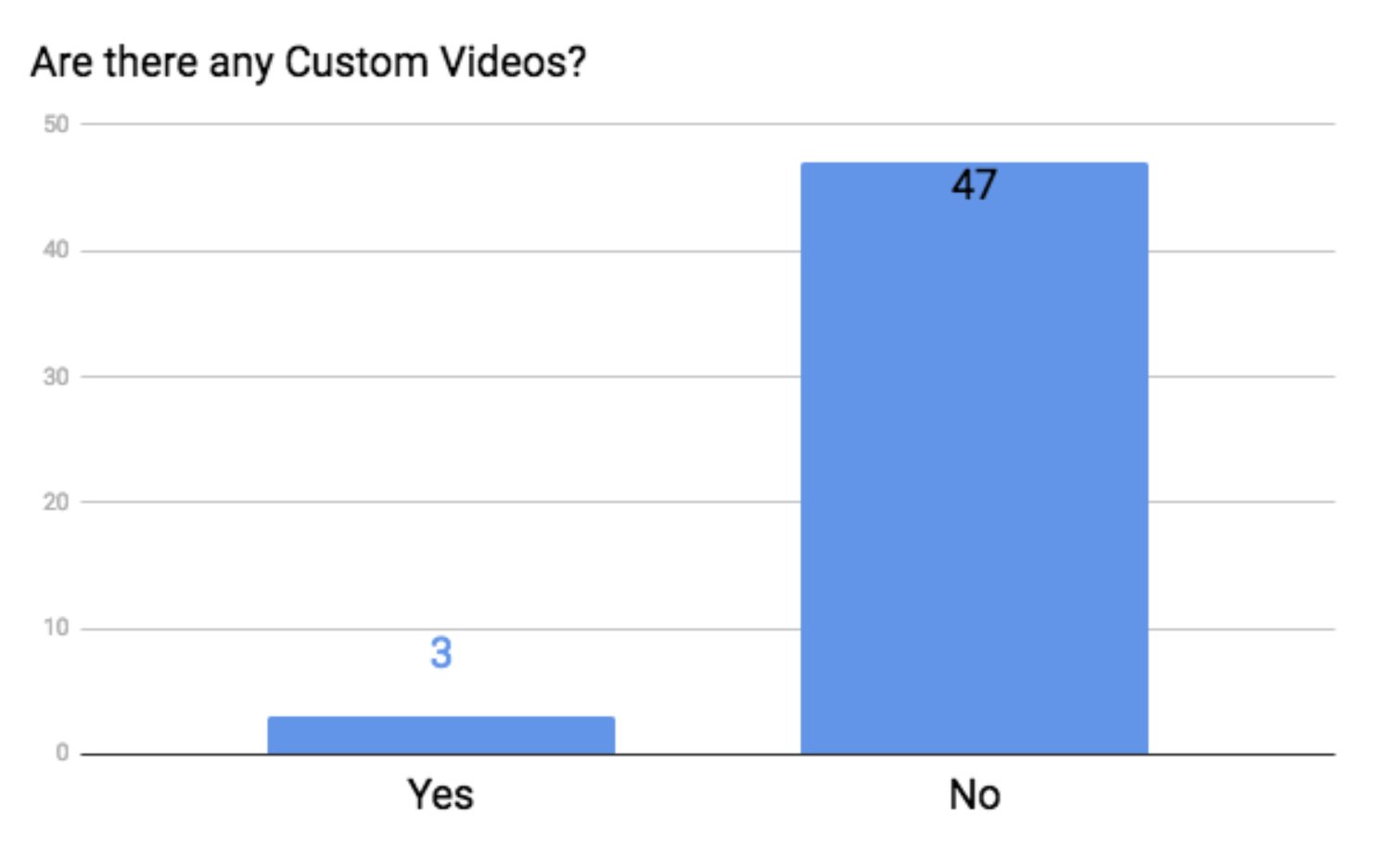
To be honest, I didn’t expect any of the sites in this study to have a custom video, but to my surprise, 3 actually did.
To give you an idea of what other people are doing, let’s check them out.
There’s a lot you can do with a custom video — you can see what some other companies did here.
12. Social Media Links
In order to have social media links, you obviously need to have accounts on social media. It’s not necessary to be on Facebook, Twitter, Instagram, Pinterest, LinkedIn, Google+, Snapchat, Vine, and Tumblr.
In fact, you should only have what you can keep up with. If you don’t have time for anything more than an occasional Facebook or LinkedIn post, then stick with Facebook and LinkedIn.
Insurance Journal recommends that you have Facebook, LinkedIn, Twitter, Google+, Pinterest and YouTube. On the other hand, Outbound Engine recommends Facebook, Twitter, LinkedIn and Google+.
In our opinion, Facebook and LinkedIn are the most important, and if you have time, we recommend adding on those other platforms like Twitter, Google+, and YouTube.
In any case, I think we all want to know how the famous 50 did!
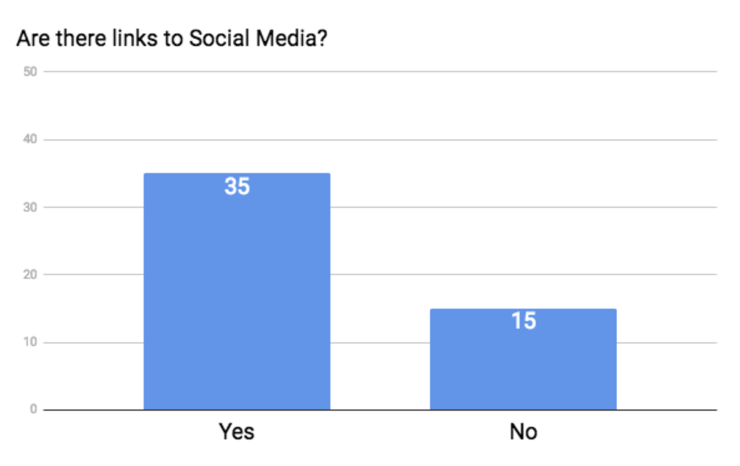
Not so bad on the social media front. The majority of the sites had links, but it is interesting to note that a few sites had links that didn’t work, so they didn’t get a point.
13. FAQ/SAQ Page
A Frequently Asked Questions or Should Ask Questions page is extremely powerful.
If you browsed through our recent article, 75 Business Leaders Reveal Their Best Tips for Staying Organized, you’ll know that many of the business leaders raved about their FAQ pages.
In fact, some of them even said that their FAQ page was equivalent to having a full-time secretary. A FAQ page can ward off a TON of time-consuming phone calls and emails.
In fact, if you set your website up with all of the elements in this article, your website should function as a 24/7 employee.
If you sell senior market insurance, your FAQ page should cover common questions, such as when is open enrollment, does it cost to have an agent, what is medicare, what does Part A and Part B cover, what is Medigap, and so on.
The beauty of a FAQ page is that it can also work to alleviate common objections that consumers might have. Find out why they hesitate to meet with you or what often stops people from buying a product, and throw it into your FAQ page.
For example, you might put a question like “Do I really need life insurance?” into your FAQ page, and your answer can work to fight against the objection of “Ehhh, I don’t think I really need life insurance.”
Sadly, our famous 50 didn’t do so hot in this arena.
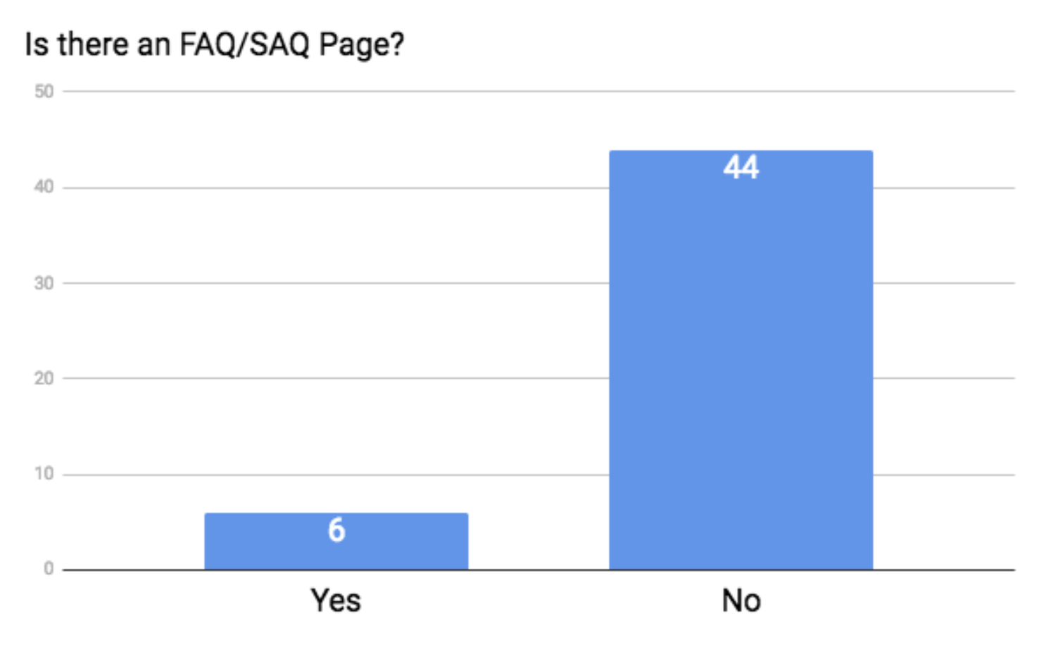
Only 6 of the websites had a FAQ page or some variation of it.
Hey, if one page on your website can function as a full-time employee… what are we waiting for?
14. Blog or Written Materials
The golden rule of having an online presence is to offer some type of value to your customers — for free.
A huge part of how we serve you, our valued agent, is by providing valuable materials for you. That comes in the form of articles, free marketing materials, guides, flyers, and so on.
In any case, many consumers want to visit your site and find out that you really do know what you’re talking about. They want to buy from an expert.
You can do that by establishing your expertise in written content. Whether that’s in the form of a blog or just really well-written product pages, there just needs to be something that shouts “I’m an expert, and I can help you.”
After you’ve been doing this for a while, you’ll have a sense for what kind of information people are looking for. What kinds of questions do people always ask? What are their common objections? Where is the most confusion?
Use that knowledge and write it down.
I’m really proud that over half of the sites had some kind of helpful content. While some had full-on blogs that were updated regularly, many just had good product pages where they explained everything about life insurance, annuities, Med Supps, and so on.
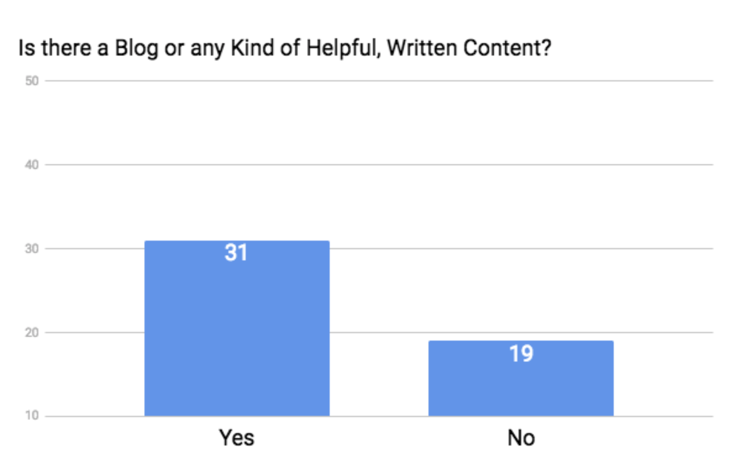
The more the merrier, but again, don’t stress out too much about this — especially if you’re a one-man show. You can’t do it all, after all.
15. Testimonials/Reviews
I can’t stress enough how important testimonials and reviews are.
Truly.
I even made an entire video on how to get them.
I mentioned this stat earlier, but I’ll mention it again: 88% of consumers have been influenced by an online review.[12]
There simply is no better way to establish your credibility. Testimonials are the key to getting real leads.
I mean it.
If you don’t want to go all out and sign up with a company like Rocket Referrals or Listen360, you can definitely send an email and ask if your customer would be willing to write a few sentences about their experience with you.
There’s nothing wrong with doing things old school if you need to.
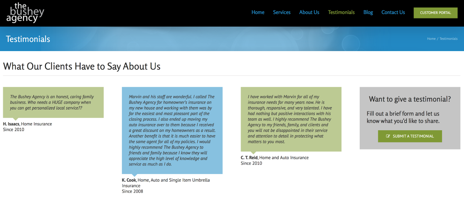
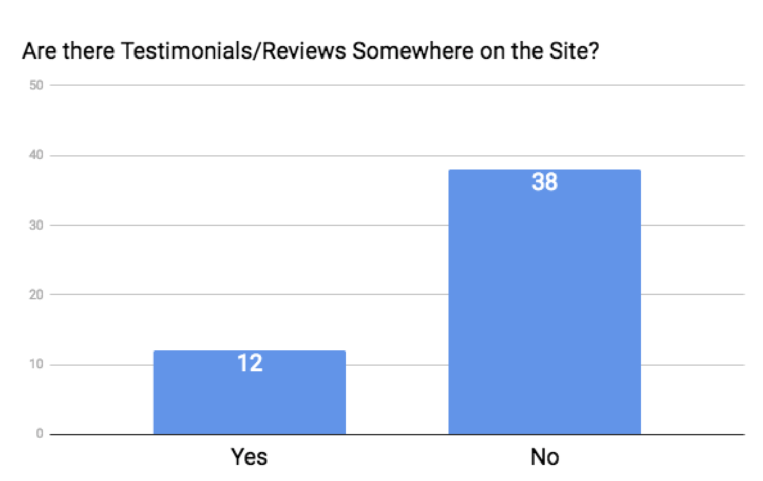
Sadly, our famous 50 didn’t take advantage of this, and only 12 of the sites featured testimonials and reviews.
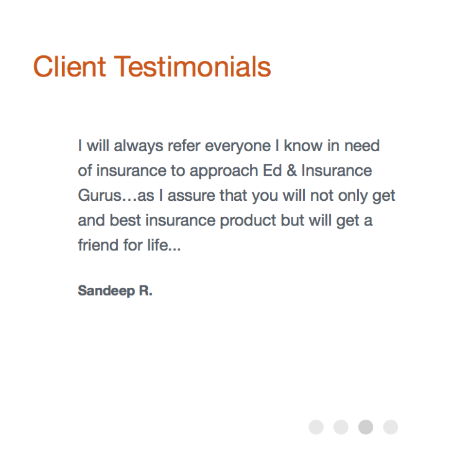
Here’s a few examples of what that looks like:

Connection
You’ve built up your website in order to get more leads, which helps more people, which makes you more money.
And the way to get those leads is to give your prospects a way to connect with you. The most obvious way is to have some kind of contact form on your site. But, there are four other ways to do this as well, and when you combine them all, you’re sure to lure more people in.
Let’s take a look.
16. Contact Form
There’s not much to say about contact forms other than you need one.
- They’re user-friendly,
- they keep your inbox clear of unnecessary spam (from putting your email address out in the open),
- they keep a record of all entries,
- they can give you the information you want and need upfront, and
- they can send an auto-response to your prospect.
In a contact form, you can make certain fields required, so if you want to know how old the person is, for example, you can add a field that asks for their date of birth.
If you just put your email address out there, you’re more likely to have some back-and-forth just collecting basic information, and that takes up more of your time. Not that this is a bad thing, but it can be easily fixed through a contact form.
Also, if you get an email from a prospect and you’re not monitoring your email at that time, the prospect may wonder if you even got their message.
A contact form can immediately send a response. It can say something like “I’ll get back to you within 24 hours,” and you can even direct them to your FAQ page or perhaps even some testimonials in the meantime.
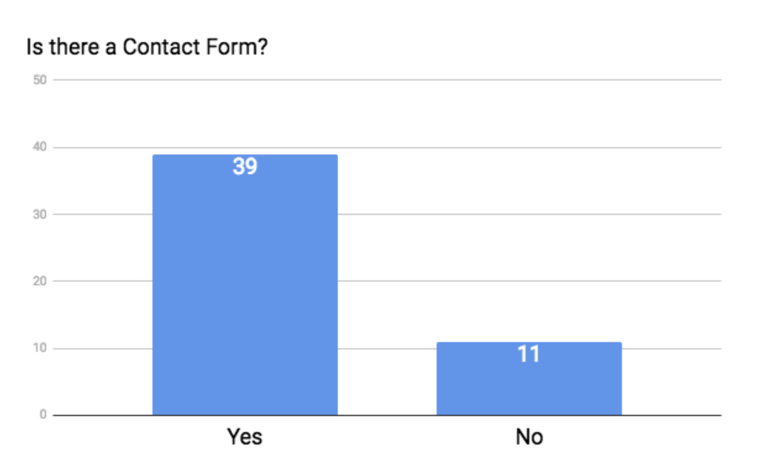
Most of the sites we studied had a contact form, so most of you probably already realize that this is a key element of a successful business website.
It is worth saying, though, that you don’t want to have too many required fields, because people might see that and get intimidated, and then they’ll leave your site. So, only collect the information that you truly need upfront.
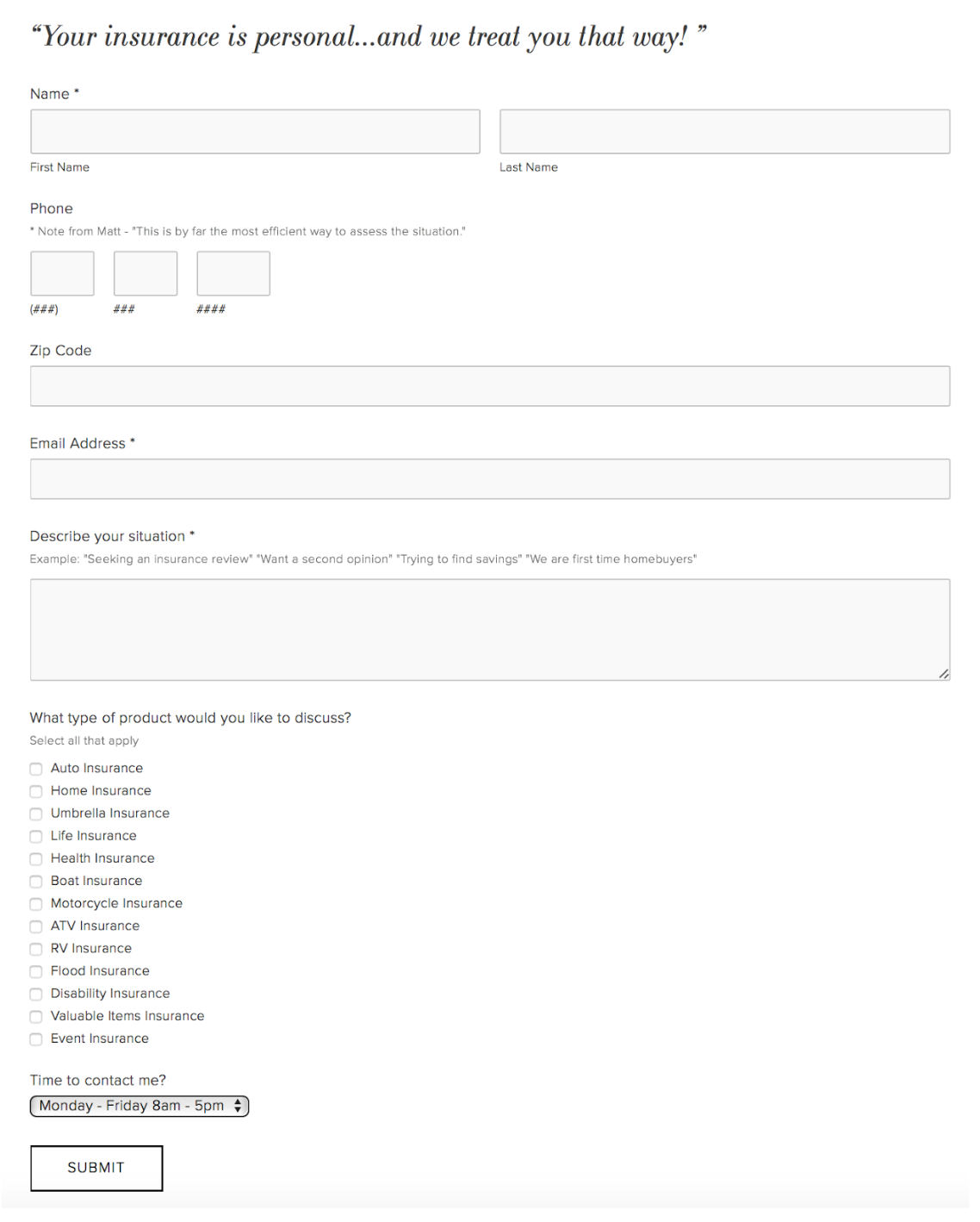
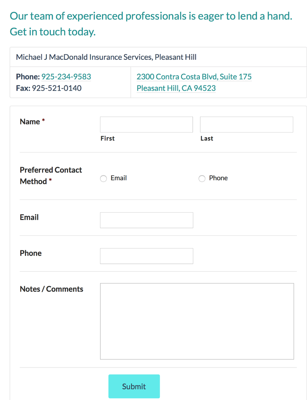
Here are a couple good examples of a contact form:
17. Request a Quote Button
This functions as the call to action (CTA).
Consumers sometimes need that nudge to move forward in the buying process. A good call to action will do this for you.
That’s where the Request a Quote button comes in.
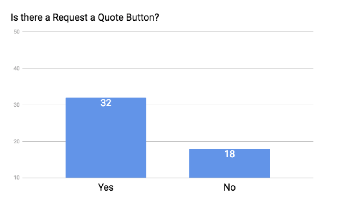
Over half of the sites had this, and many even had it in multiple areas.
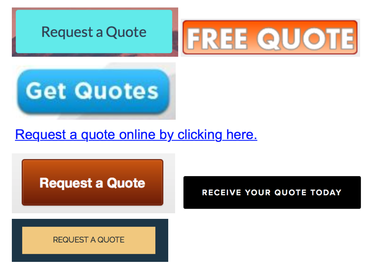
Here’s a little montage of quote buttons from our study:
Since you can’t really have a pricing page, this button can function in its place.
18. Subscribe Form/Email Collection
This is another element that I didn’t expect many of the sites to have. It doesn’t seem intuitive to collect a prospect's email, because you probably don’t view yourself as a marketer.
BUT, don’t kid yourself. You are. You have to be.
Here’s why:
- 91% of consumers use email daily, and 58% of adults check their email first thing in the morning.[13]
- In 2015, email marketing yielded an average 3800% return on investment for businesses in the United States.[14]
- 72 percent of consumers prefer email as their source of business communication.[15]
- Email marketing drives more conversions than any other marketing channel, including search and social.[16]
Capture the email, and you’re on the way to a sale.
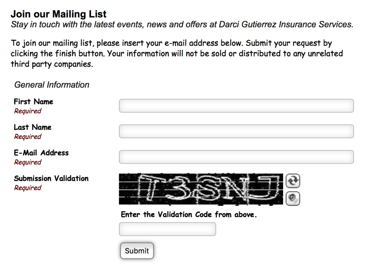
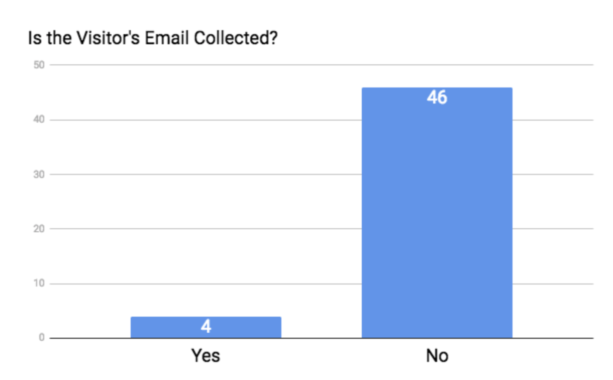
Only 4 of the sites tried to capture the consumer’s email:
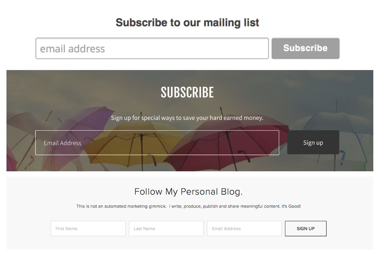
And here’s what that looks like:
19. Auto-Response Upon Subscription
Isn’t it the worst when you subscribe to something and you’re not sure if it worked?
It’s best practice to send an immediate follow-up so that the consumer knows they’re heard and that you appreciate them.
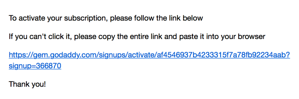
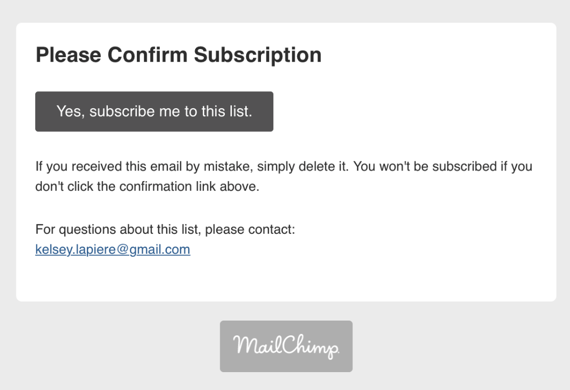
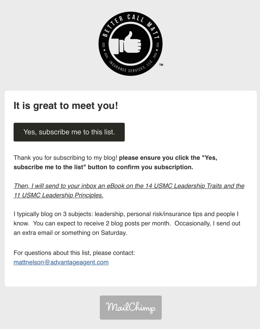
Three of the four agents did send an immediate response, but I will add that it’s been about 2 months, and I haven’t gotten any additional emails from any of them. Update: It's been 3 years, and I still never heard back from any of them.
So, with all of this being said, if you capture an email… use it!
Remind people of who you are, nurture the relationship, and when the time comes, you’ll be the go-to guy!
Here’s what those follow-up emails looked like:
20. Calendar for Appointments
We’ve made it! This is the last element that we looked at, and I must say that I’m somewhat surprised.
Insurance is an industry that’s based around appointments, so you’d think that more websites would have a place to schedule one, right?
Well, I was dead wrong.
Only one site had a calendar, and here’s what it looked like:
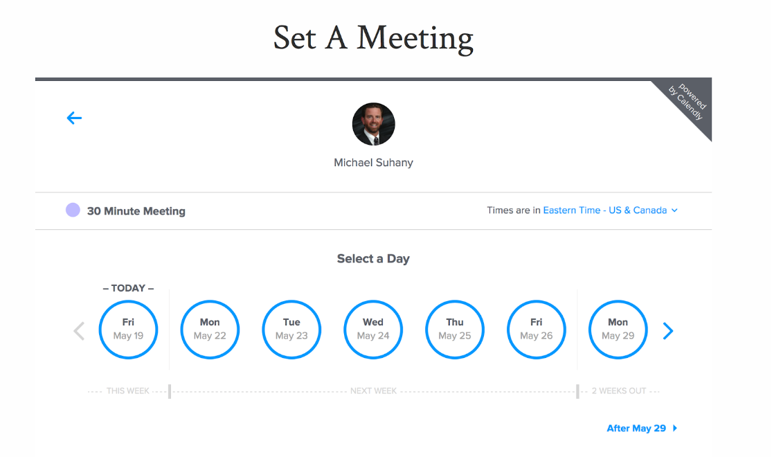
It’s an excellent feature to add to your site, and it’s one that’s often overlooked.
We recommend Calendly or Acuity Scheduling, as they're both user-friendly, and it also sync up with your current calendar so that you’re never double-booked.
More Interesting Observations
Alright, friends, we made it!
Before we part ways, I wanted to point out a few observations that I thought were interesting.
The first is the hosting provider that these agent sites used. Here’s a pie chart to give you a good idea:
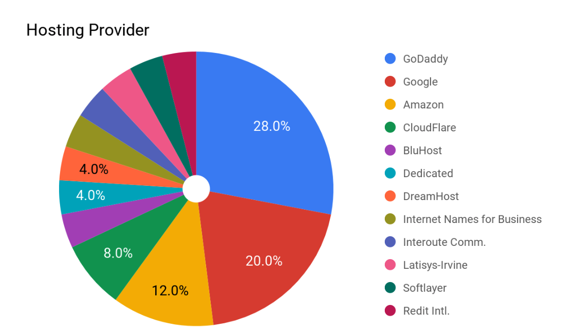
Most of the sites used GoDaddy with Google and Amazon trailing closely behind. By the way, you can find out what any site is built with by going to https://builtwith.com.
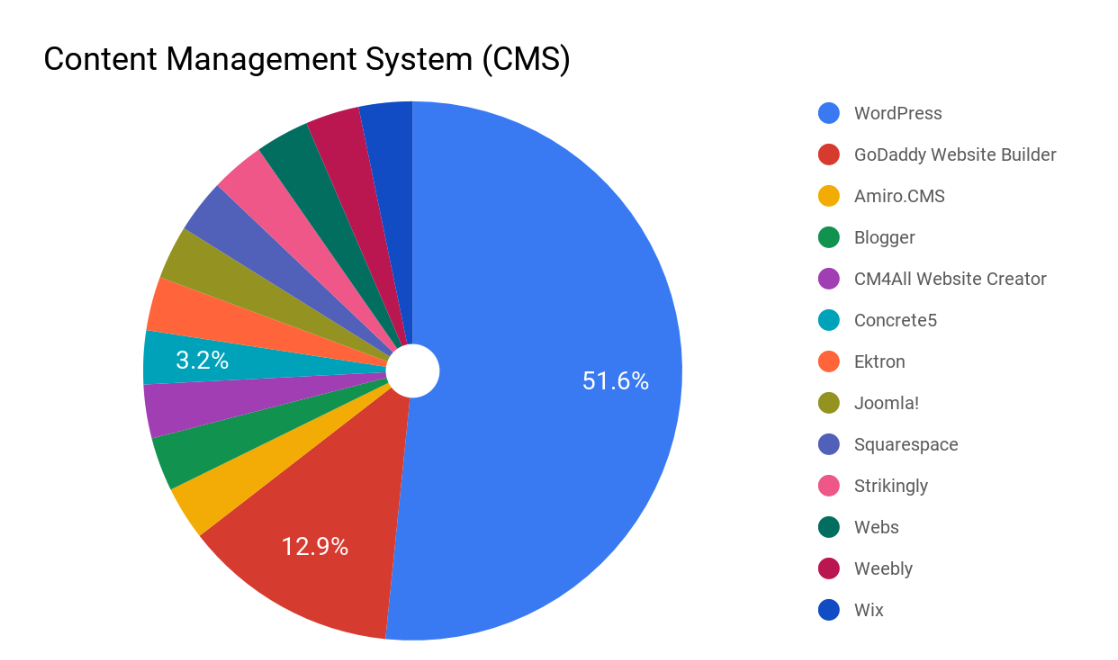
Also, these are the content management systems (CMS) that were used. Unsurprisingly, WordPress was the most popular.
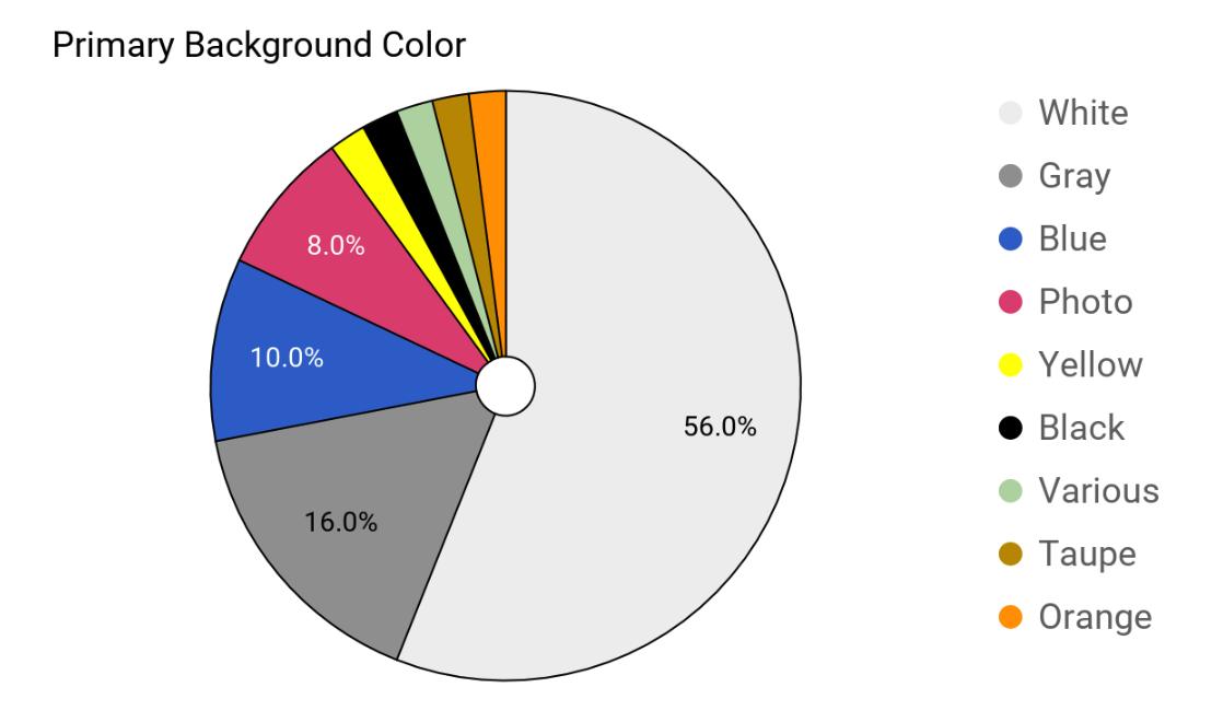
Another fun little piece of information is the most popular background colors. White beats everyone out here at 56%.
I mean, if Apple does it, it’s probably a good idea.
Finally, something else that caught my eye is that many of the sites kept saying “we do this” and “our goal is to…” when the company was really a one-man operation.
I understand that those agents were probably trying to give the impression that they’re more credible by doing this (i.e: large staff, many people standing behind you, etc.), but I got the opposite impression.
I went to their “Staff” page, and they were the only person there. It caught me off-guard, and it made the agent seem impersonal, and it was downright not true. I would much rather read something like “I’ve been in the business for this many years” and “My goal is to..”
In any case, it’s the 21st century, and it’s time to roll up our sleeves and get in the game.
We’d like to know — do you have a website? Please let us know in the comments below – If you have one, share your URL. If you don't, why not? Do you not want one, is it too big of a project, do you not know where to start? Be specific.
We've moved our blog to a new platform - here's a link to comments that were shared before the move.
